Uncontained Experience
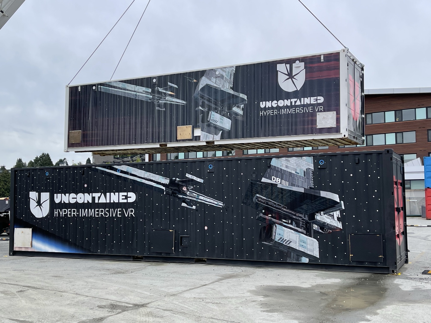
A VR venue built inside a shipping container, where I was the only designer across the hardware and the software. That meant the wrist straps players wore and the mounts they clipped into, the operator controls staff ran the room with, the container facade, and the game inside it.
Role
Product Designer
Company
XR Immersive Tech
Year
2022 · 8 months
Type
Product & Experience Design
01 — Overview
VR in a box. For everyone.
There were really two products here. Uncontained is the physical platform: a portable shipping container fitted with Vive headsets, Leap Motion hand tracking, haptics, scent and heat. Deep Signal is the game that runs inside it. The way the team described it internally was a console and a cartridge, and the container is built so other games can be loaded into it later.
My job spanned both, because a visitor doesn't experience two products. They walk up to a shipping container in a car park, queue, get handed equipment, sit down, play, and leave. Every seam between the hardware and the software is somewhere that journey can break.
What it needed was a designer who could translate that hardware into something people could actually use, operate, and inhabit.
I was that designer — the only one on the project. Over 8 months I worked end-to-end across every design surface: UX flows, in-game UI screens built in Unity, onboarding design, physical wrist straps for players, and the exterior facade of the container itself. Working alongside programmers, artists, and writers on an agile team, my scope covered the full experience — from the moment someone approached the container to the moment they left it.
02 — My Role
One designer across the whole product.
The scope ran the full spectrum, with no handoffs to another designer and no specialisation boundaries.
UX & Onboarding
Designed the full player journey from container entry through to active gameplay — including onboarding flows, operator interfaces, and the phased narrative structure that helped first-time VR users orient before the experience began.
In-Game UI & Unity
Designed the in-game UI — diegetic panels, interaction prompts, and HUD elements built for Leap Motion hand tracking — and worked directly in Unity to implement game flow changes, having designed games on the platform before. Iterated through usability testing cycles until the in-headset experience held up.
Physical & Environmental Design
Extended the design scope beyond the screen — designing custom wrist straps for players and the exterior facade of the shipping container itself, creating a cohesive experience from first contact to last.
03 — Defining the Problem
Two users, two failure modes, and the clock between them.
The experience had two user groups with almost nothing in common, and the existing design had failed to account for either of them properly. Sitting underneath both was a third problem that decided whether the venue made money.
The Player
Most players arriving at Uncontained had never used VR before. They were being dropped into a dense sci-fi narrative with hardware they didn't understand, controls that required explanation, and no scaffolding to help them orient before the experience started. The result: confusion in the first few minutes, missed narrative beats, and sessions that felt shorter than they were because players spent too long figuring out the basics.
The Operator
Operators — often teenagers working front-of-house at family entertainment centres — were expected to manage sessions, troubleshoot hardware issues, and restart experiences using interfaces designed for developers. There was no dedicated operator view. Everything required navigating menus that assumed technical knowledge the operators didn't have, and couldn't easily acquire mid-shift.
The Turnaround
A venue like this sells fixed time slots, so capacity is decided by how fast one group can leave and the next can start. Between those two moments sits everything: collecting and cleaning equipment, fitting the next group, calibrating them, and getting them seated, while a queue managed through Waitwhile builds outside. None of that is the experience anyone paid for, and all of it competes with the experience for the same clock. Minutes lost in the turnaround come out of either the session or the day's capacity, and there is no third place for them to come from.
The hardware could deliver something genuinely remarkable. The UX was the ceiling — and it was low.
04 — Design Process
Storyboard first. Build second.
Working inside a live development pipeline meant design decisions had real cost if they were wrong, whether that cost was engineering time or a print run. The approach was the same either way: resolve as much as possible on paper first, sketching in Procreate and working interfaces up in Figma, so the team could react to an idea before anyone committed to building it.
Wrist Straps
The most useful thing I found on this project came from standing in the room rather than running a session of research. Players wore straps on their wrists for hand tracking, and watching live sessions I kept seeing the same thing: people fumbling to get them on, an operator stepping in to help, and the queue backing up behind them. It happened every session.
Nobody had complained about the straps. Asked directly, players talked about the game. The problem was only ever visible by watching, and it was costing minutes at the front of an experience sold in fixed time slots. We moved to a magnetic quick-attach design that a first-time visitor could put on unaided, which took the operator out of the loop and gave the time back to the experience itself.
The bigger win was one I hadn't set out to solve. The straps and the tracking sensors used to be cleaned as a single unit, and because the sensors couldn't be handed out dirty, the next group couldn't have anything fitted until the previous set had been through cleaning. That put the whole turnaround on the critical path: clean, then fit, then start. Making the sensor detach magnetically split those two things apart. The straps could be cleaned on their own and fitted to the incoming group before they ever entered the room, so the fitting stopped waiting on the cleaning.
That is also how we validated it, by how much work each operator had to do rather than by a stopwatch. If the same session needs fewer operator interventions, the change is real.
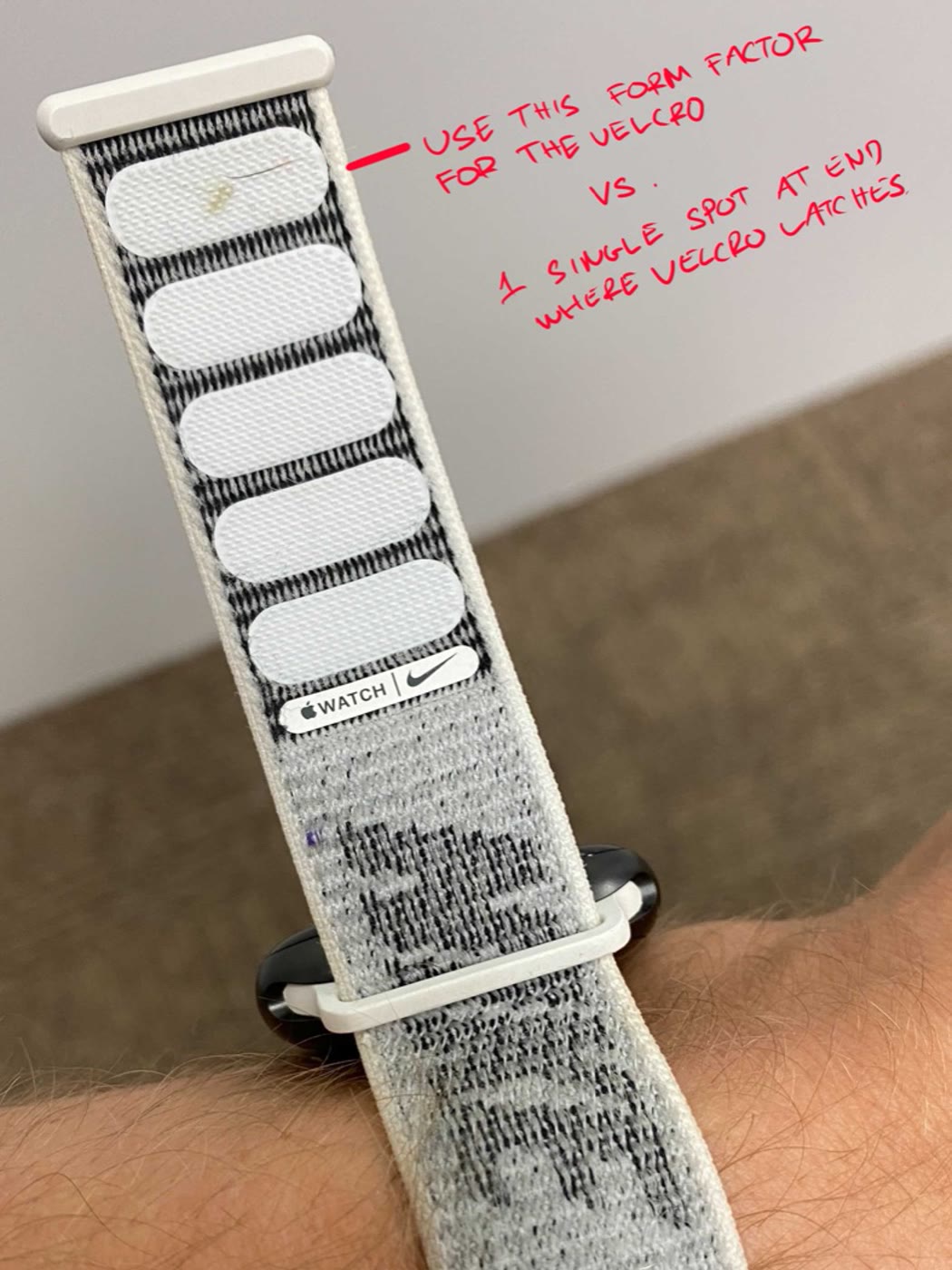
The Velcro one started as an Apple Watch band. I had been wearing the Nike sport loop, where the hooks run along the length of the strap instead of landing on a single patch at the end, which means it closes anywhere and does not need to be lined up. That is the right behaviour for someone fitting a strap in a hurry, so we took it. What we did not take was the band itself. I tested a slim band early and the sensor is heavy enough that it rotated around the wrist as soon as anyone moved, and a rotated sensor means the hand shows up in the wrong place in the headset, which is worse than a slow strap. So the final design is a wide neoprene wrap that spreads the load and holds its position, closed with a full-length Velcro loop borrowed from a watch strap.
The parts were printed by Tangible Interaction, and the way we worked was a loop. I sketched the initial design and layout for the concept, they turned it into something manufacturable and sent the drawings back, I put the parts in front of real users and sketched the changes that came out of that, and they revised. Neither side could have done it alone. They knew what a printer could actually hold, and I knew what happened when a stranger tried to put it on in fifteen seconds with a queue behind them.
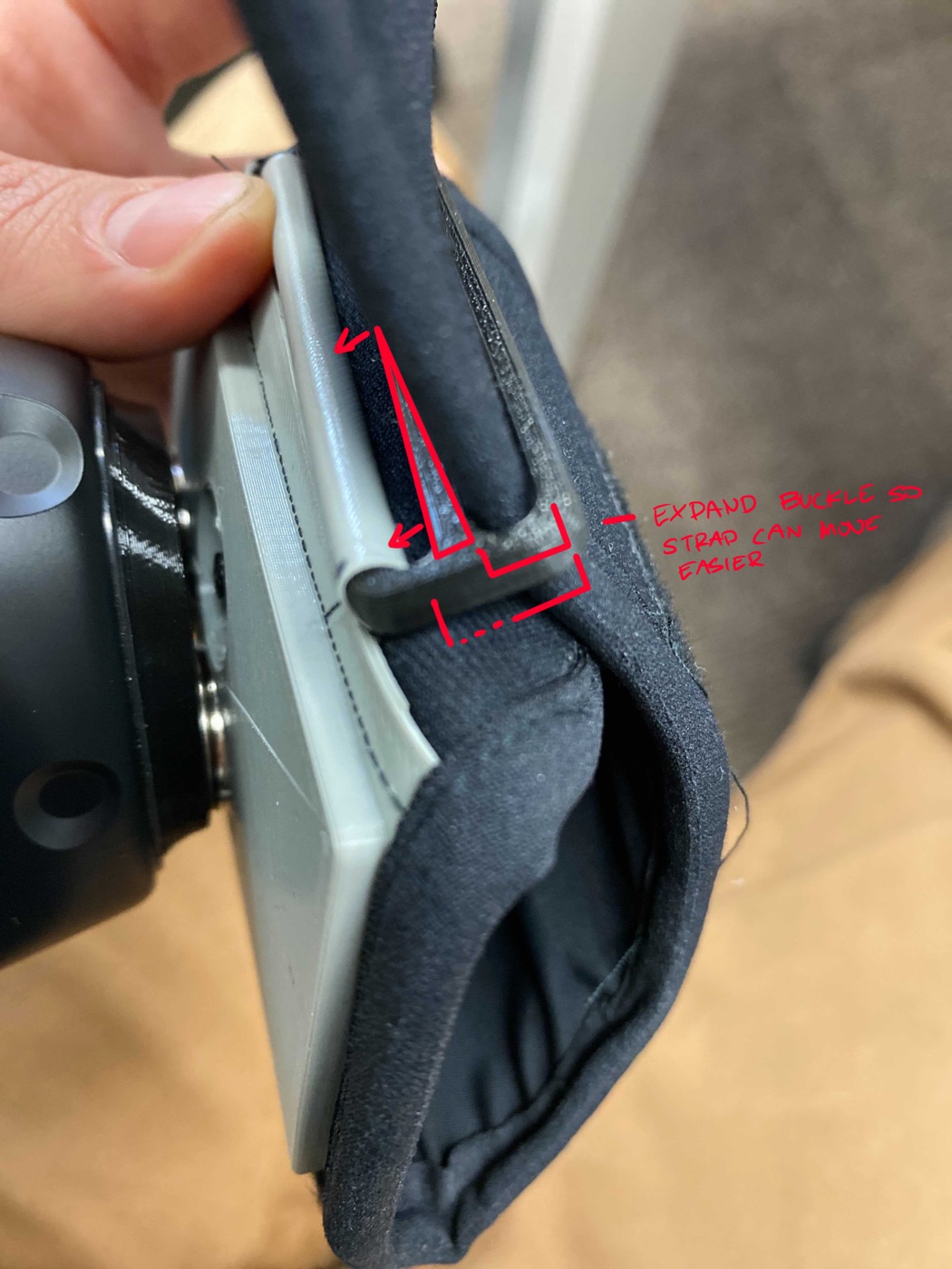
My half of that loop mostly looked like marked-up photographs. I would wear a prototype, use it the way an operator would, and send back annotated shots of the specific thing that was wrong. Three of those requests are in the shipped bill of materials: a printed stopper to clean up the raw strap end, a wider buckle so the strap could be pulled through in one motion, and a change to how the Velcro worked.
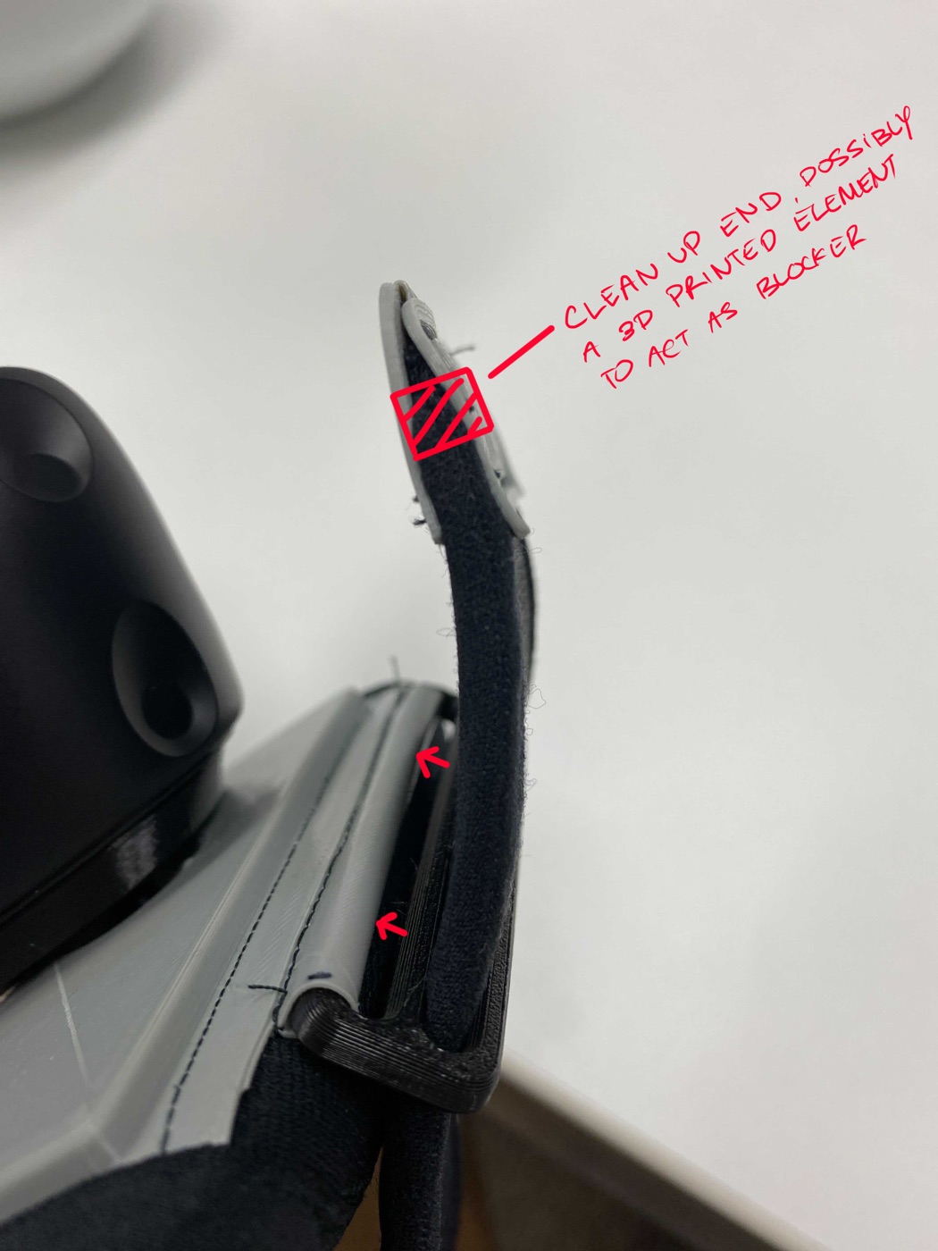
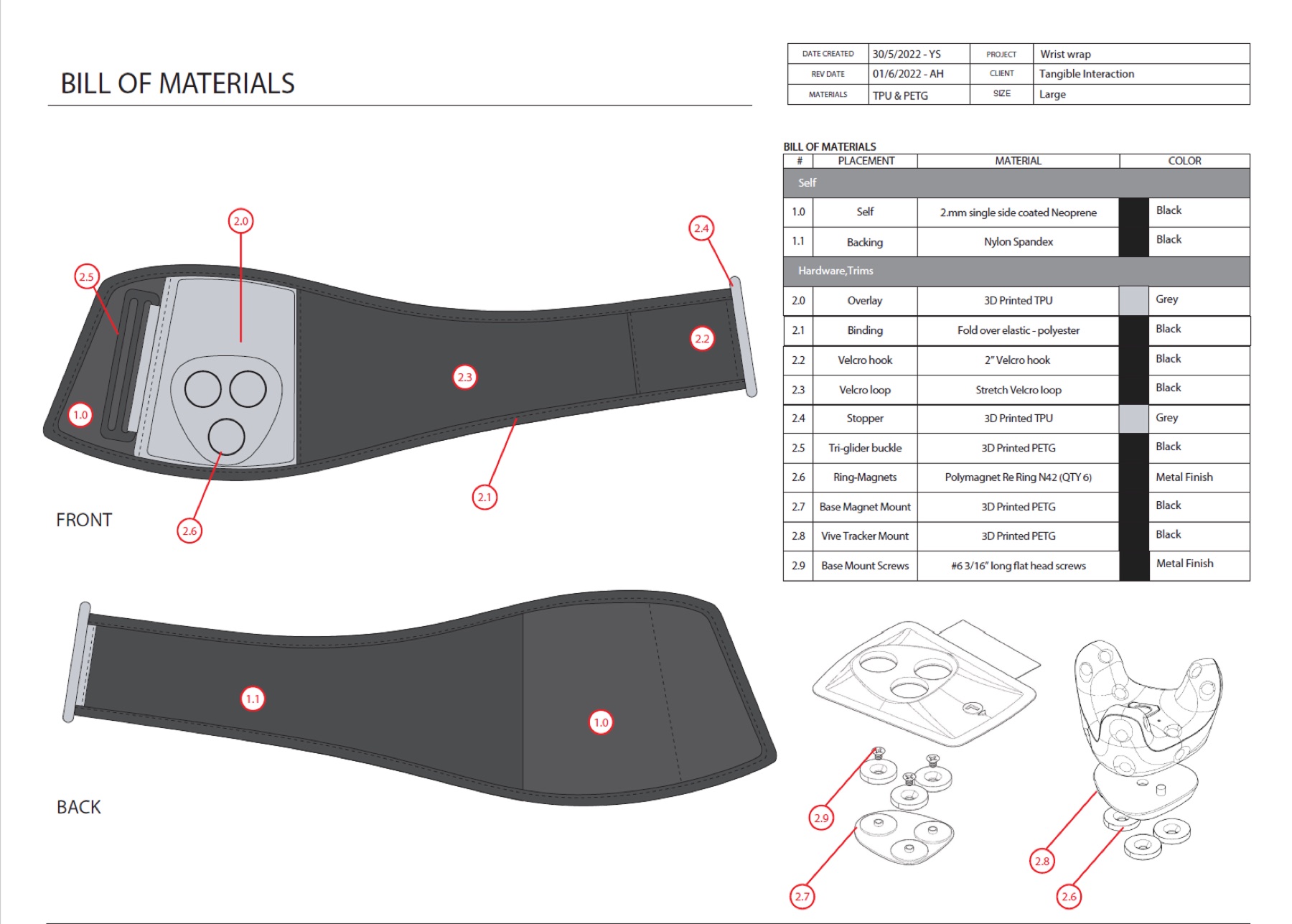
The finished strap is a neoprene and nylon-spandex wrap closed with Velcro, carrying a 3D printed TPU overlay and a set of PETG structural parts: a base magnet mount, a Vive tracker mount and a tri-glider buckle, held together with #6 flat head screws around six N42 ring magnets.
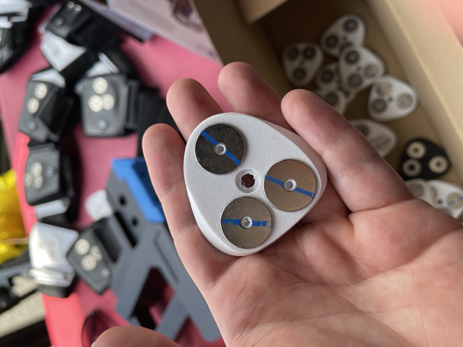
Rather than decide the mount on paper, we built three versions of the underside and ran them during the soft launch: one with cutouts leaving the magnets exposed, and two that covered them behind a face of printed plastic. Even a thin layer between the magnets and the metal it was gripping cost enough holding force to be felt, and the exposed version was the one that held. It is an obvious result written down, and it was not obvious enough to skip testing.
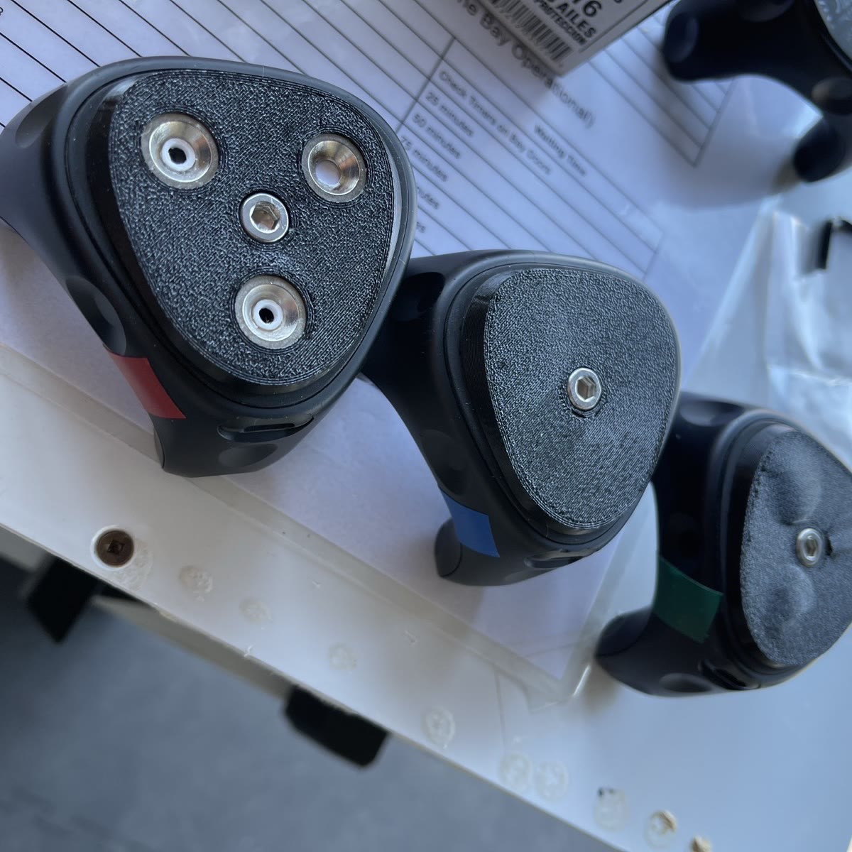
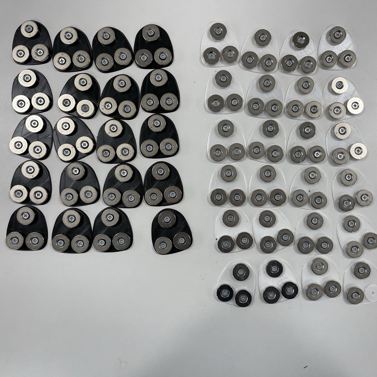
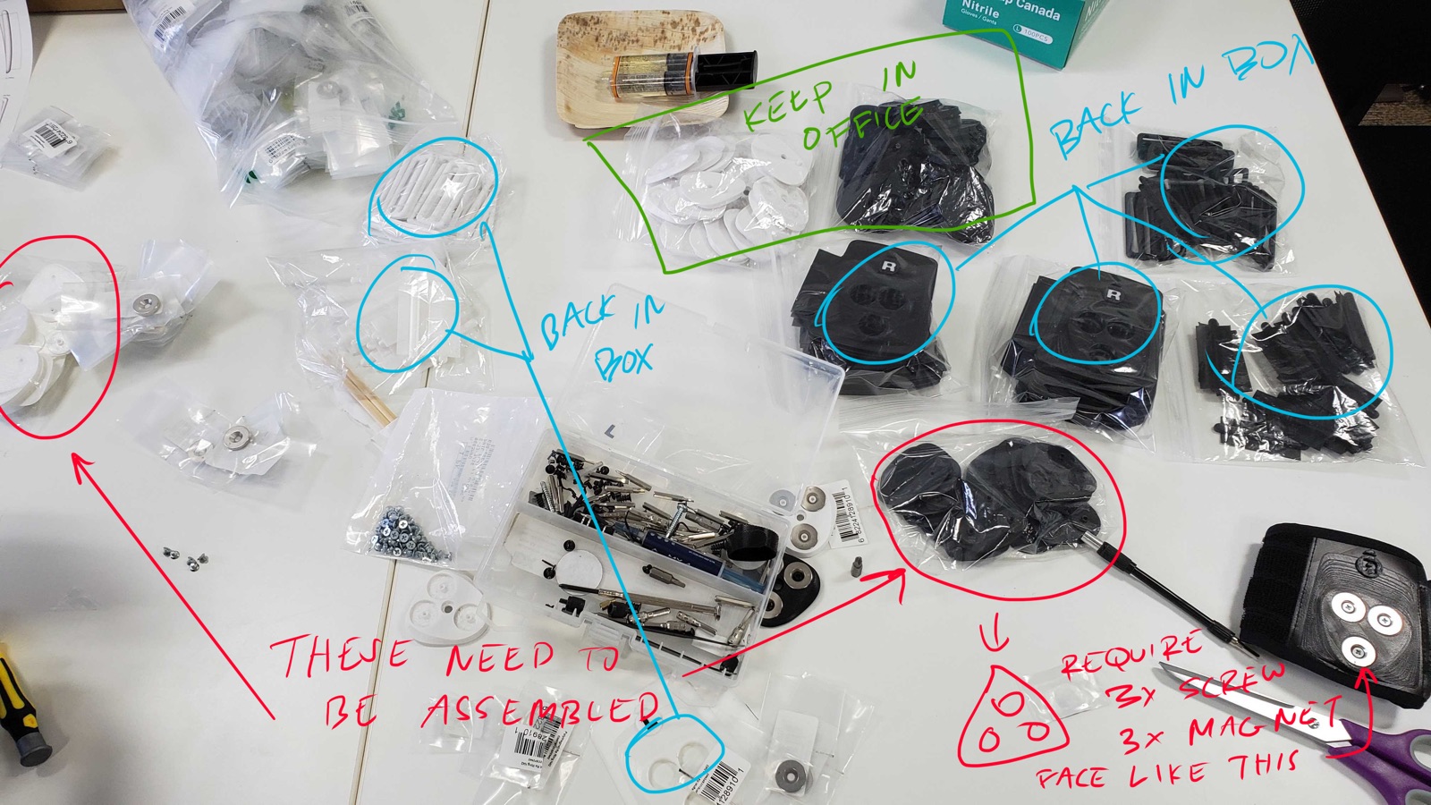
Months of real use found the limits. The magnets were stronger than they needed to be, which made the release harder than intended and put more force through the mount every time it came apart. And 3D printed parts are fine for proving a design and wrong for one that gets pulled apart and clicked back together dozens of times a day. The wear came from repetition, not from any single failure, so it was invisible for the whole period we were testing it. The next version needs a weaker magnet and a material chosen for cycle life rather than for how fast we could print it. A part that survives a pilot has not yet been shown to survive a season.
Colour as the Instruction
Colour did the rest of the explaining. Every piece of equipment a visitor touched was coded to their role, red for the Gunner, blue for the Tactician, green for the Engineer, carried across the headset, the trackers and the station they sat at. Nobody had to remember which role owned which gear, or follow any of the world's language to get it right. They matched a colour. The straps themselves were split white and black, one for each arm, so a strap could not end up on the wrong wrist. It removes a whole category of mistake without anyone being told anything, which matters when the person fitting the equipment is nineteen, it is their fourth group of the hour, and the queue is watching.
The colour was doing more than labelling. Each strap fastened in a set direction, wrapping from the outside of the arm inward, so black and white were not interchangeable even if you got them onto the correct wrists. That is also where the design shows its bias: the fastening sequence suited right-handed visitors, and a left-handed person had the more awkward version of the same task. It was the right call for the common case and I would still make it, but I would want the mirrored version tested with left-handed users rather than assumed, which is not something we got to inside the run.
Operator Interface
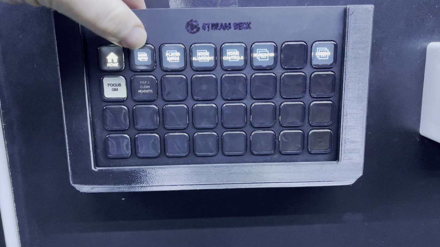
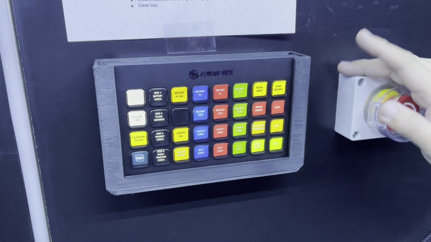
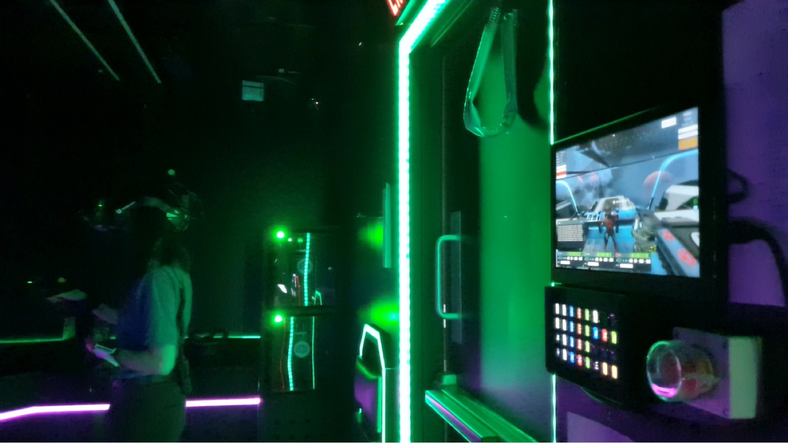
The first priority was getting operators out of developer tools. I mapped the full operator workflow — every action they needed to take before, during, and after a session — and built a dedicated interface around it. Game monitoring, session controls, and hardware status were consolidated into a single view accessible from the front-of-house position, without requiring operators to leave the space or navigate nested menus.
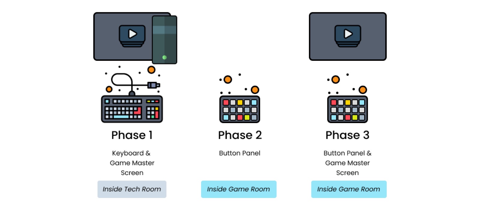
It moved in stages. The first version was a keyboard and a game master screen in the tech room, which meant leaving the bay to do anything. The second put a physical button panel inside the bay. The third added the game view back alongside it, so an operator could see what was happening and act on it without moving. The final panel lives in a 3D printed housing on the bay wall, with the setup sequence numbered on the keys and colour used to separate routine actions from the ones that interrupt a session.
Onboarding & Narrative
Deep Signal's world was rich — but it was being delivered all at once. The redesign broke the pre-experience into phases, giving players time to absorb the setting, understand the controls, and build a baseline level of comfort with the headset before any real gameplay stakes appeared. Complex sci-fi terminology was simplified or contextualised through environmental storytelling rather than explanation.
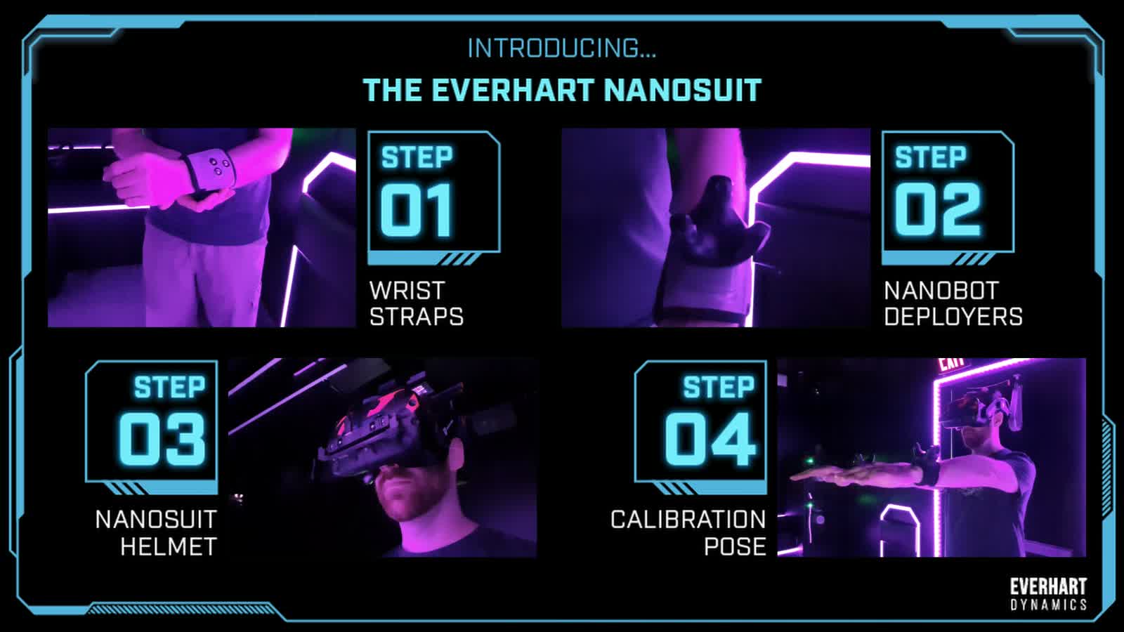
Part of that was a short onboarding video every group watched before going in. It taught the four things a player had to physically do, in order, framed in the world's own language rather than as instructions: put on the wrist straps, attach the nanobot deployers, fit the helmet, hold the calibration pose. Teaching the gear inside the fiction meant nobody had to be talked through it twice.
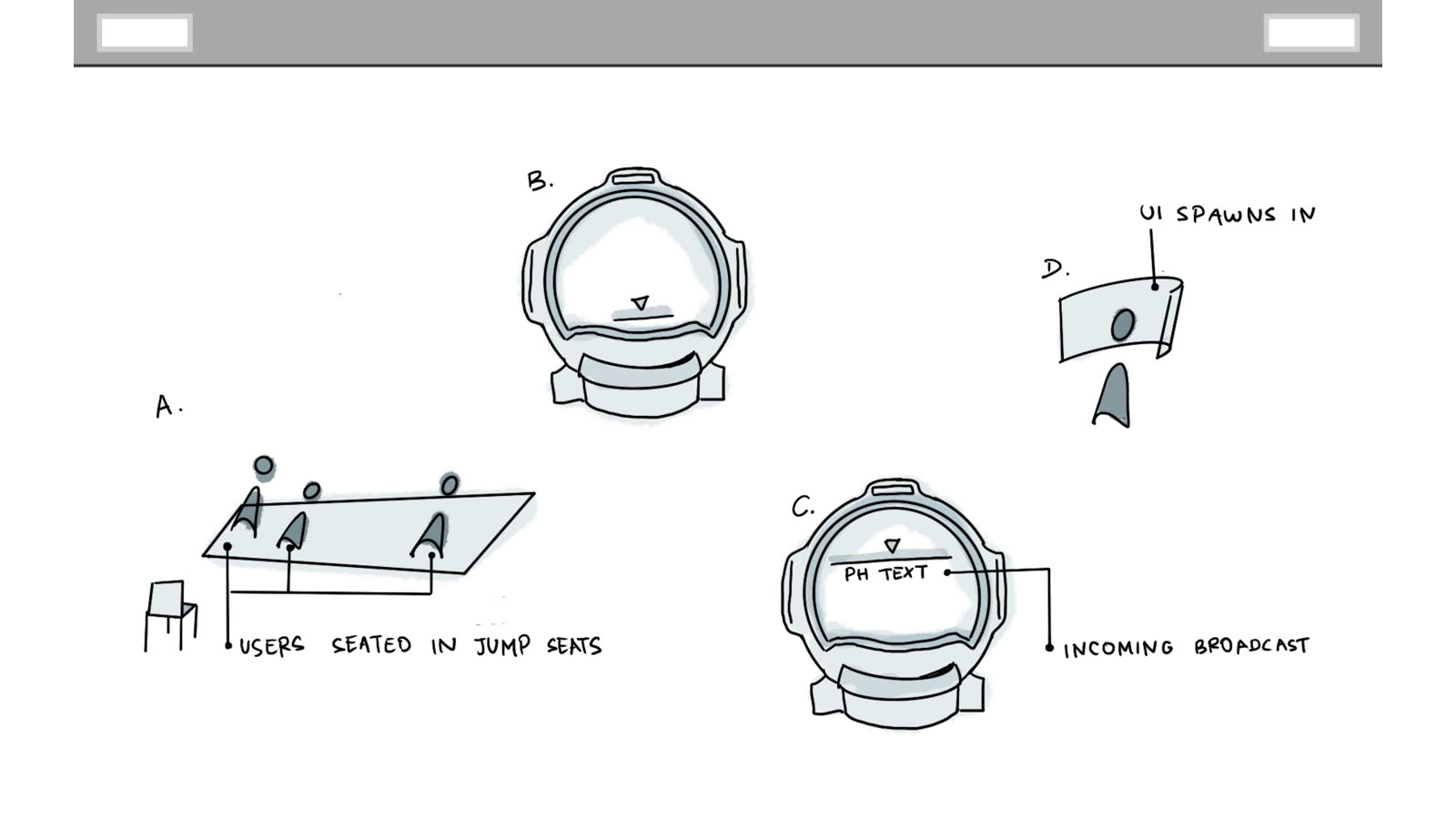
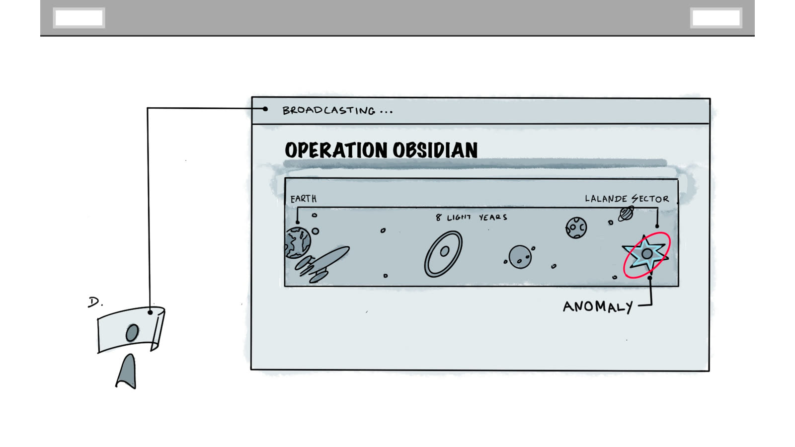
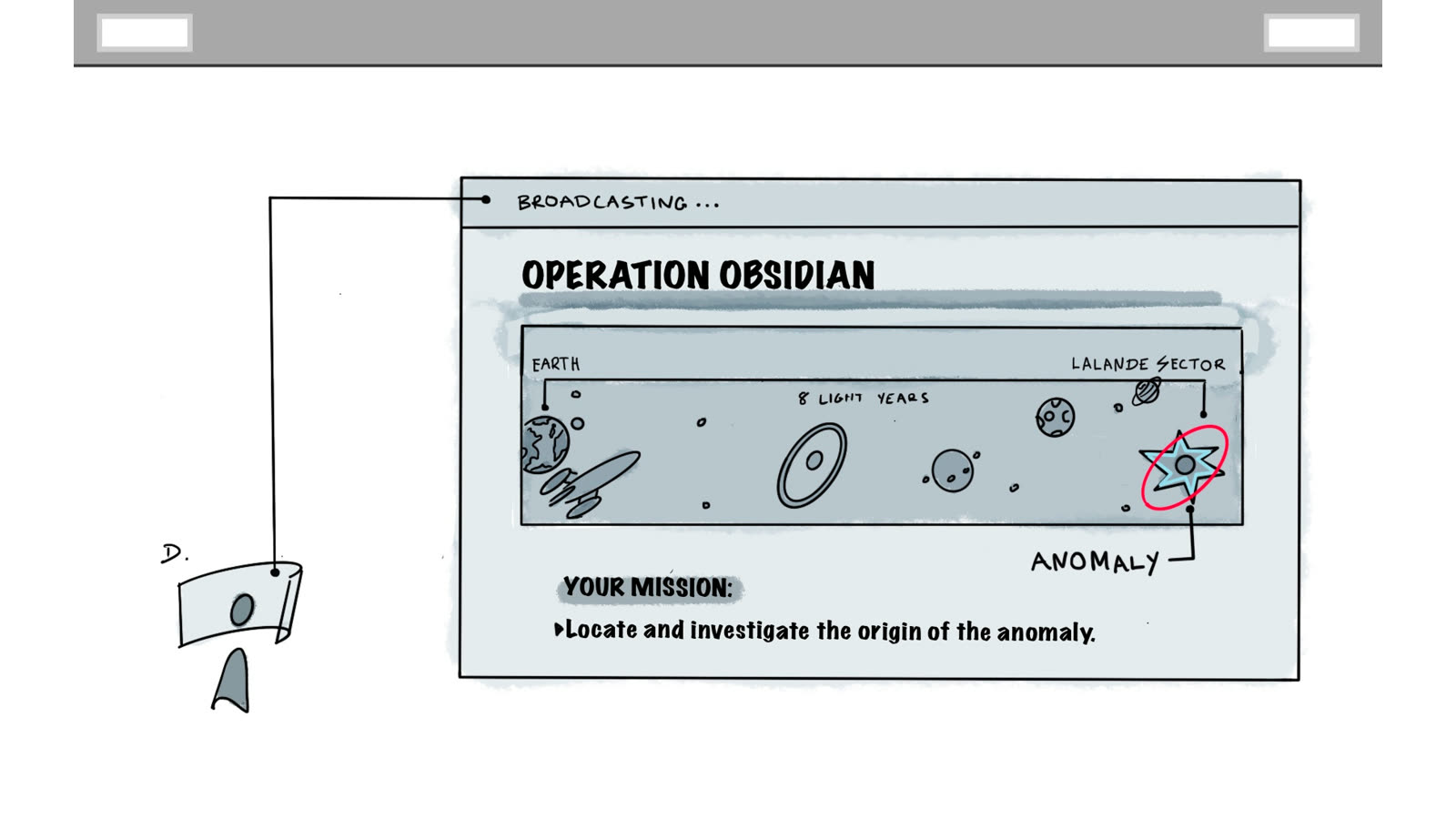
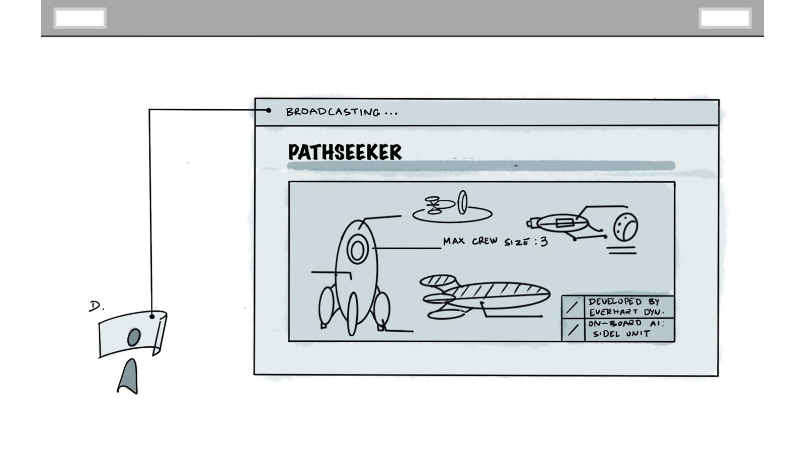
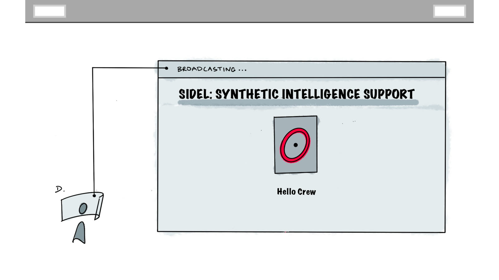
Inside the headset, the same job had to be done again for the mission itself. I storyboarded the briefing by hand first, thirteen panels covering every beat of what a player sees and hears before the ship launches, because it was far cheaper to be wrong on paper than in Unity. Once the sequence held up, our artist mocked it up and the UI team implemented it, and I stayed on as the reviewer to keep the intent intact.
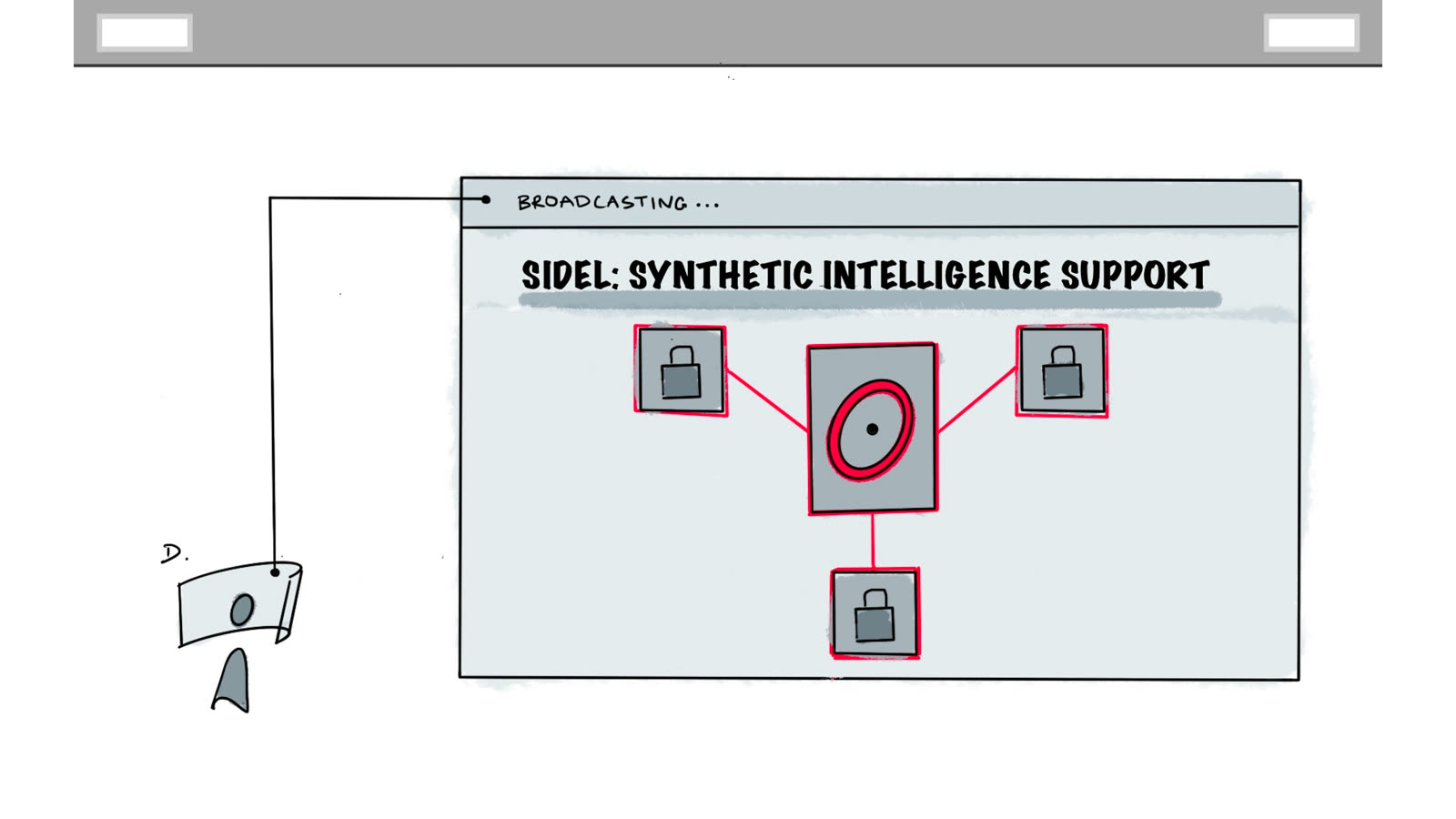
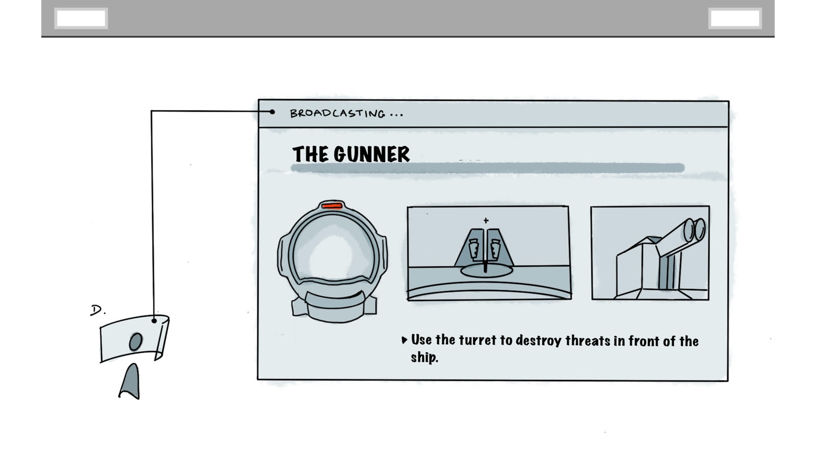
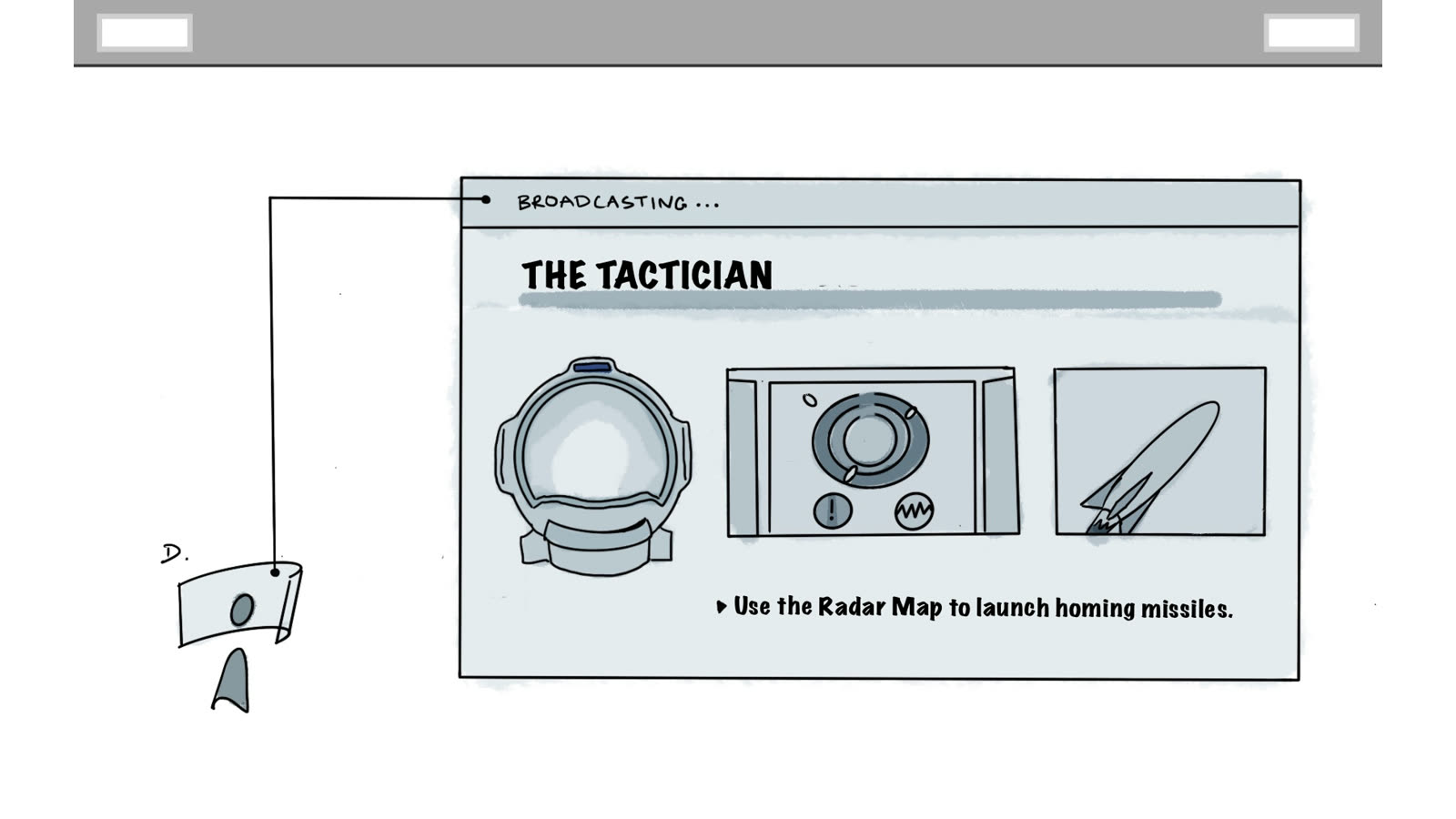
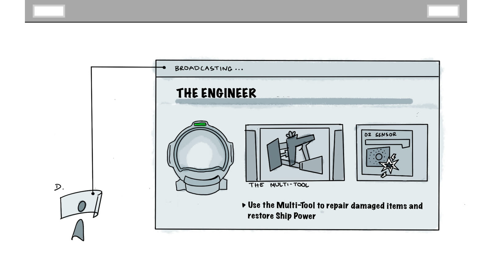
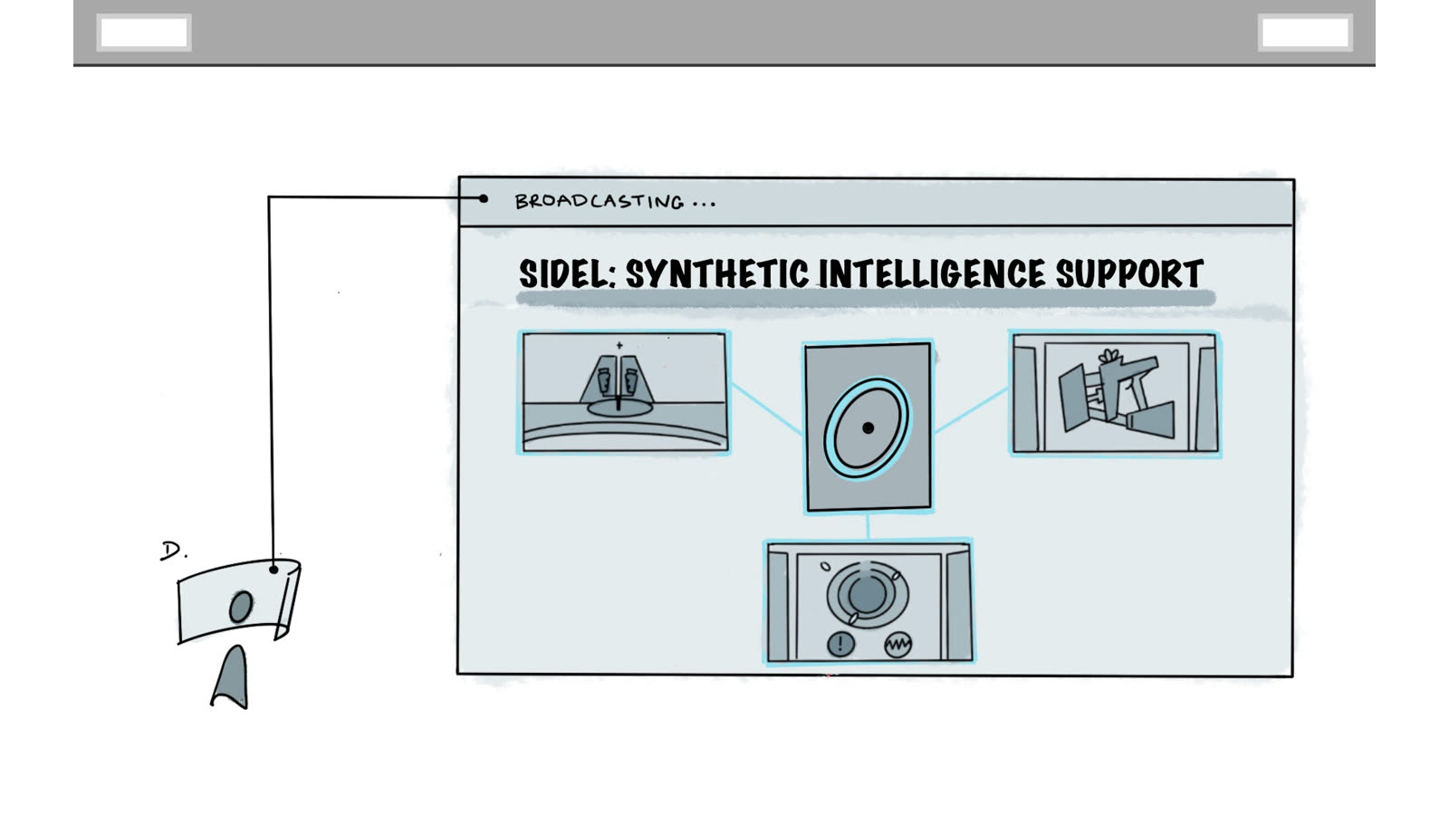
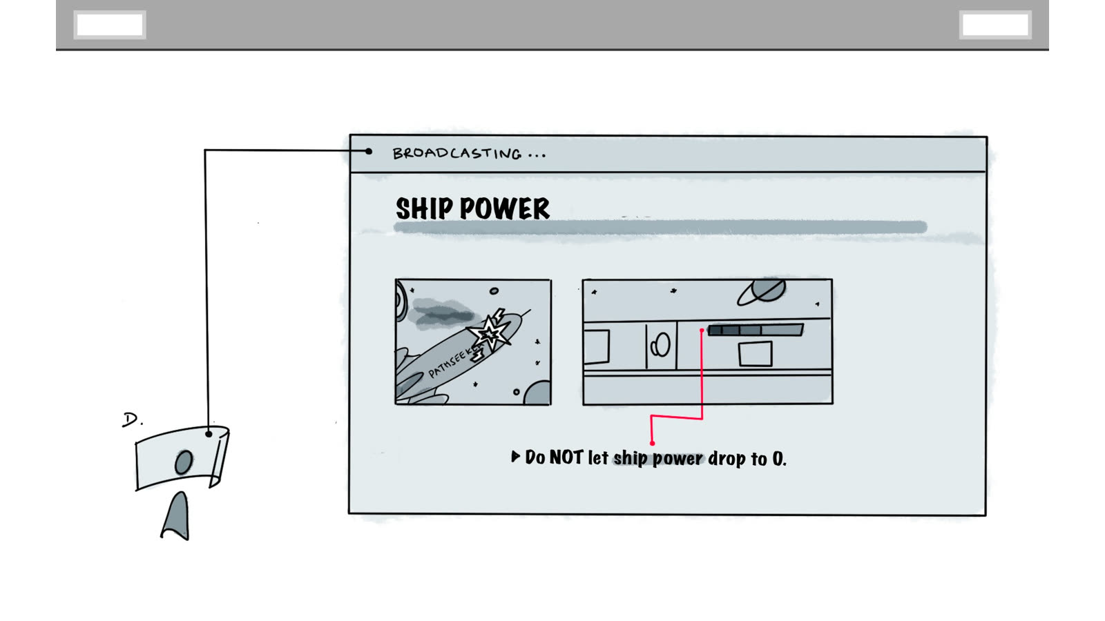
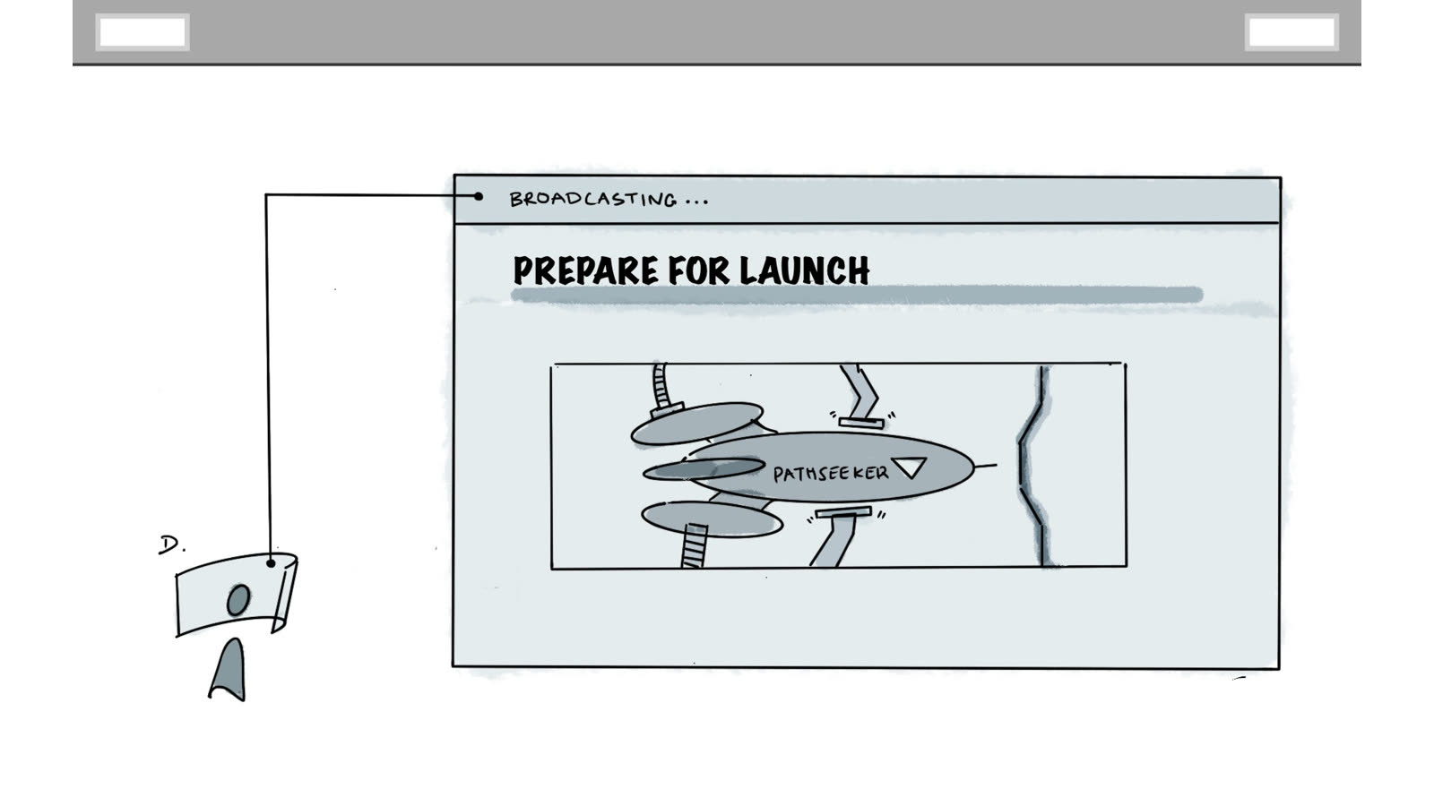
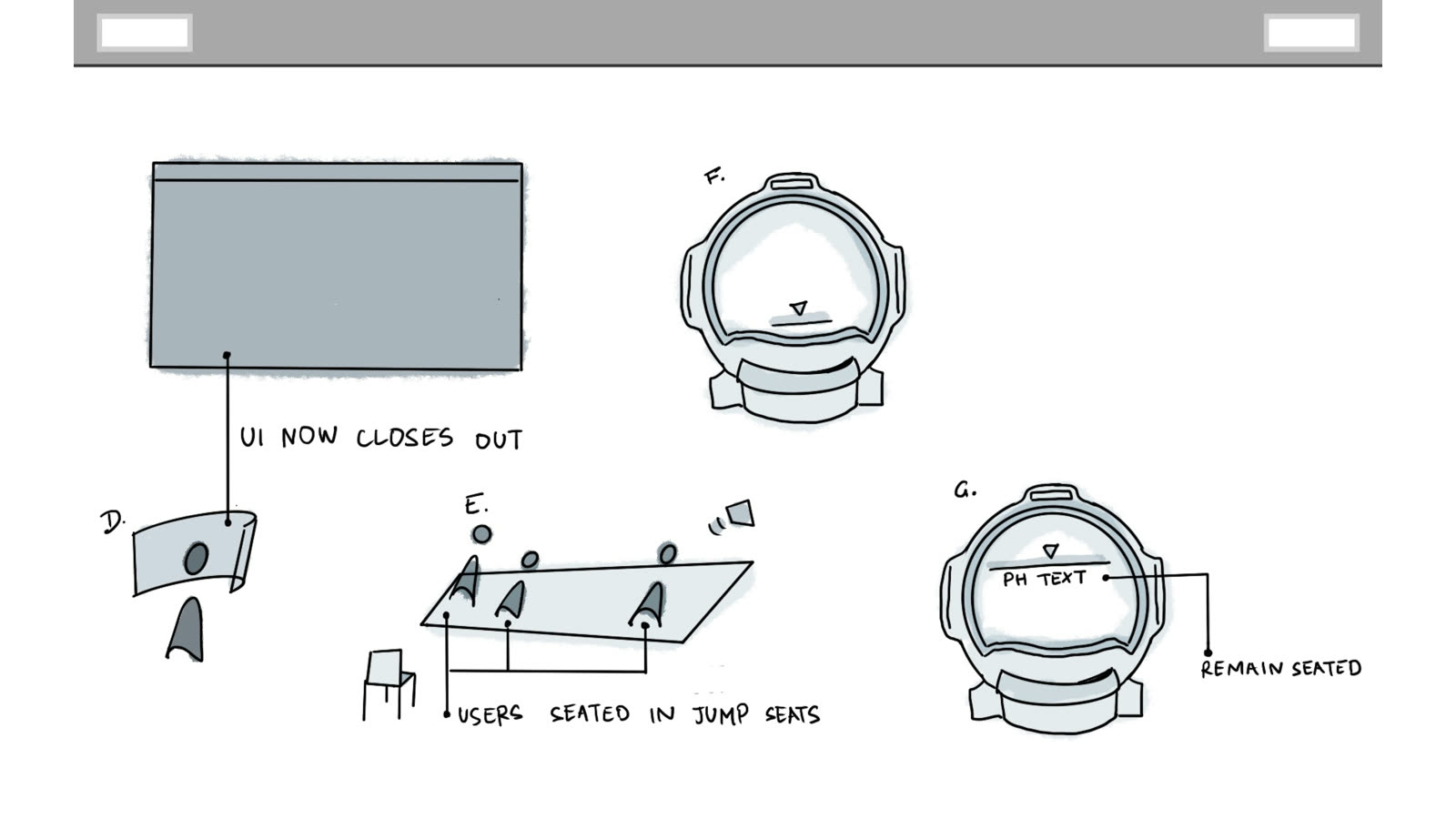
In-Game UI
In-headset UI presented a specific challenge: standard UI conventions don't translate cleanly into VR, particularly with Leap Motion hand tracking where interaction relies on gesture rather than controller input. I designed a set of in-game panels that communicated clearly in three-dimensional space — using scale, depth, and diegetic placement to keep the interface consistent with the world rather than floating on top of it. These went through multiple rounds of usability testing before being signed off.
05 — Outcomes
A smoother path from the door to the headset.
The redesign addressed both failure modes. Players could orient themselves and engage with the narrative before the full experience began, and operators had a purpose-built interface that fit the way they actually worked. The onboarding and wrist strap changes together cut the time it took to get a group from the door into the headset by roughly 40 percent, which lifted throughput about 20 percent across a venue selling fixed time slots. Ticket sales over the engagement rose about 32 percent, though that is a venue-level number with marketing and novelty mixed into it, so I would not hang it on any one change.
Those figures come from throughput counts rather than a lab: we measured groups per session during a soft launch at the PNE, made the changes, and measured again at the official launch. It's a before and after across two real deployments with real queues, which is less controlled than a formal study and more honest about what a venue actually does on a busy day.
06 — Reflection
What working in an emerging medium taught me.
VR UX is still genuinely unsolved in a lot of ways — there's no established playbook for onboarding novice users into a haptic, multi-sensory environment, and the constraints are unusual enough that standard interaction patterns rarely apply cleanly. That made this project as much about first-principles thinking as it was about execution.
The most valuable lesson came from usability testing: what players said they found confusing and what they actually got stuck on were rarely the same thing. Watching someone in a headset navigate something you designed is a different kind of feedback than any survey or interview can produce — and that gap between stated and observed behaviour shaped how I run research on every project since.
Working as the sole designer in an agile team also reinforced the importance of making ideas legible to non-designers quickly. Storyboards and rough UI sketches moved faster than polished Figma files — and a decision made clearly in a five-minute standup was worth more than a detailed spec that nobody read.