Shubenacadie Canal Exhibit
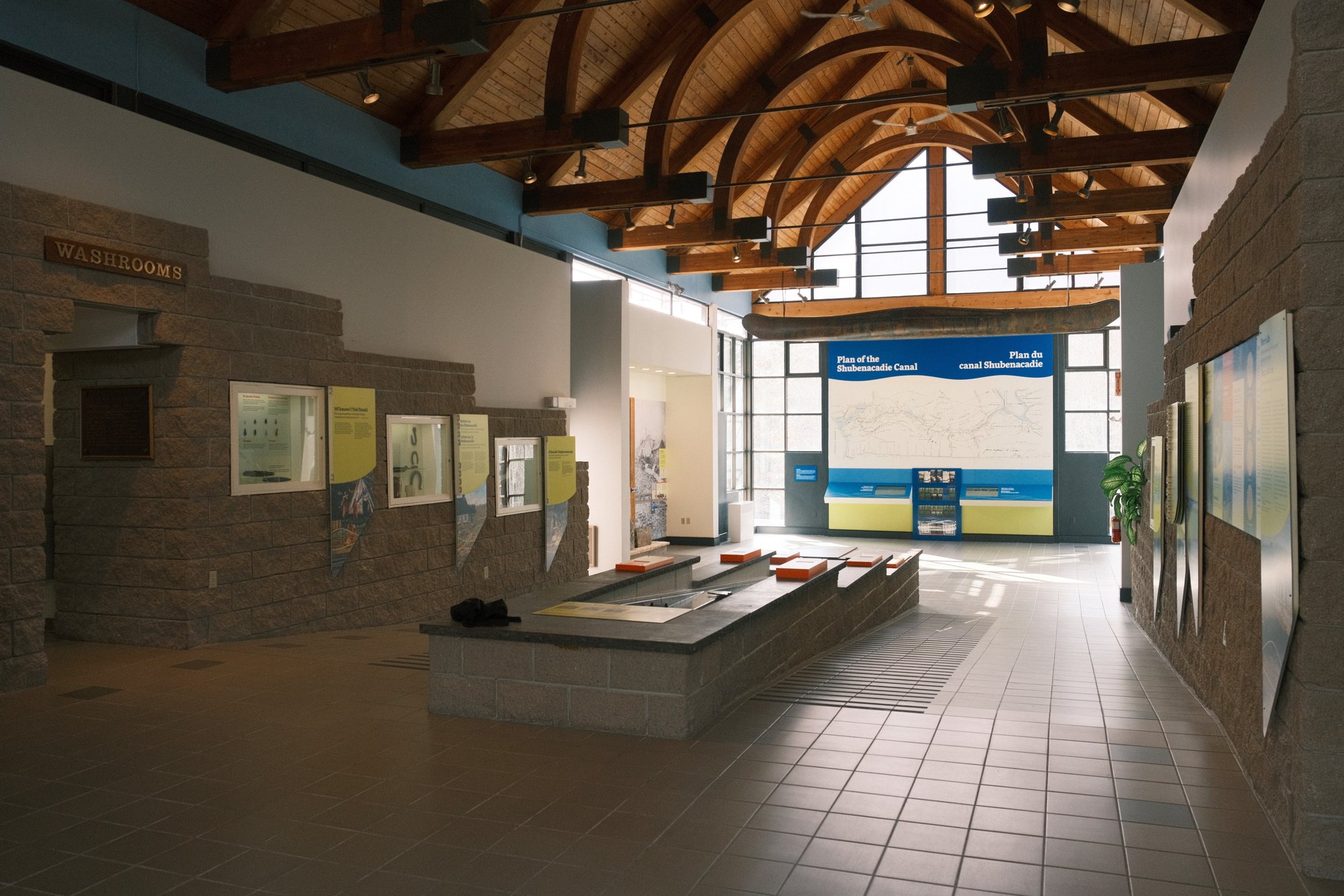
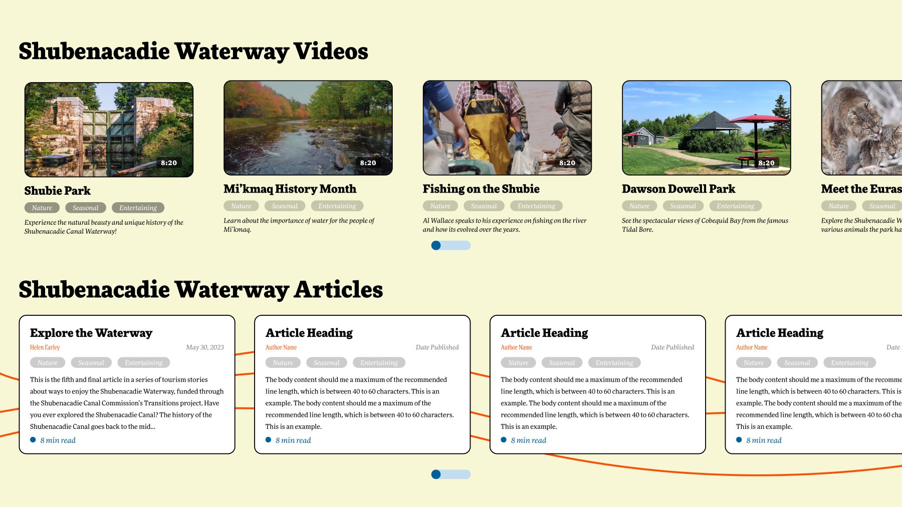
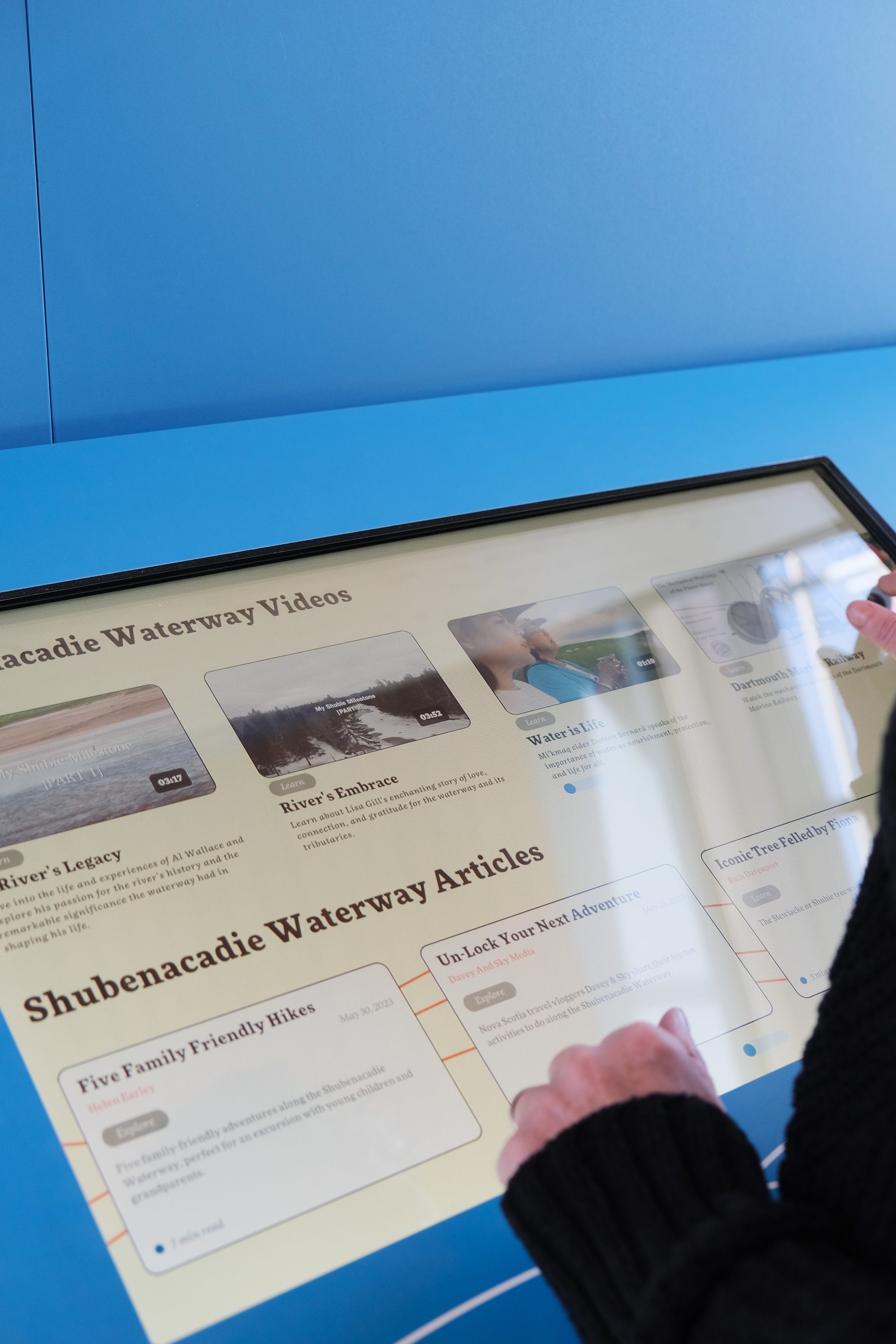
Two linked touchscreen applications in the main hall of the Fairbanks Interpretive Centre — a map of the 114-kilometre Shubenacadie waterway, and a stories screen whose videos and articles follow the place you select on it.
Role
Experience Designer — Digital Installations
Client
Shubenacadie Canal Commission
Type
Interactive Installation
Location
Dartmouth, NS
01 — Overview
A centre about a waterway, not just a canal.
The Fairbanks Interpretive Centre sits in Shubie Park in Dartmouth and had been telling the story of the Shubenacadie Canal since 1987. In 2023 the Shubenacadie Canal Commission redeveloped it end to end, widening the subject from the canal's construction to the whole waterway — thousands of years of cultural and natural history along the 114 kilometres connecting Halifax Harbour to the Bay of Fundy. The rebuilt centre opened to the public in November 2023.
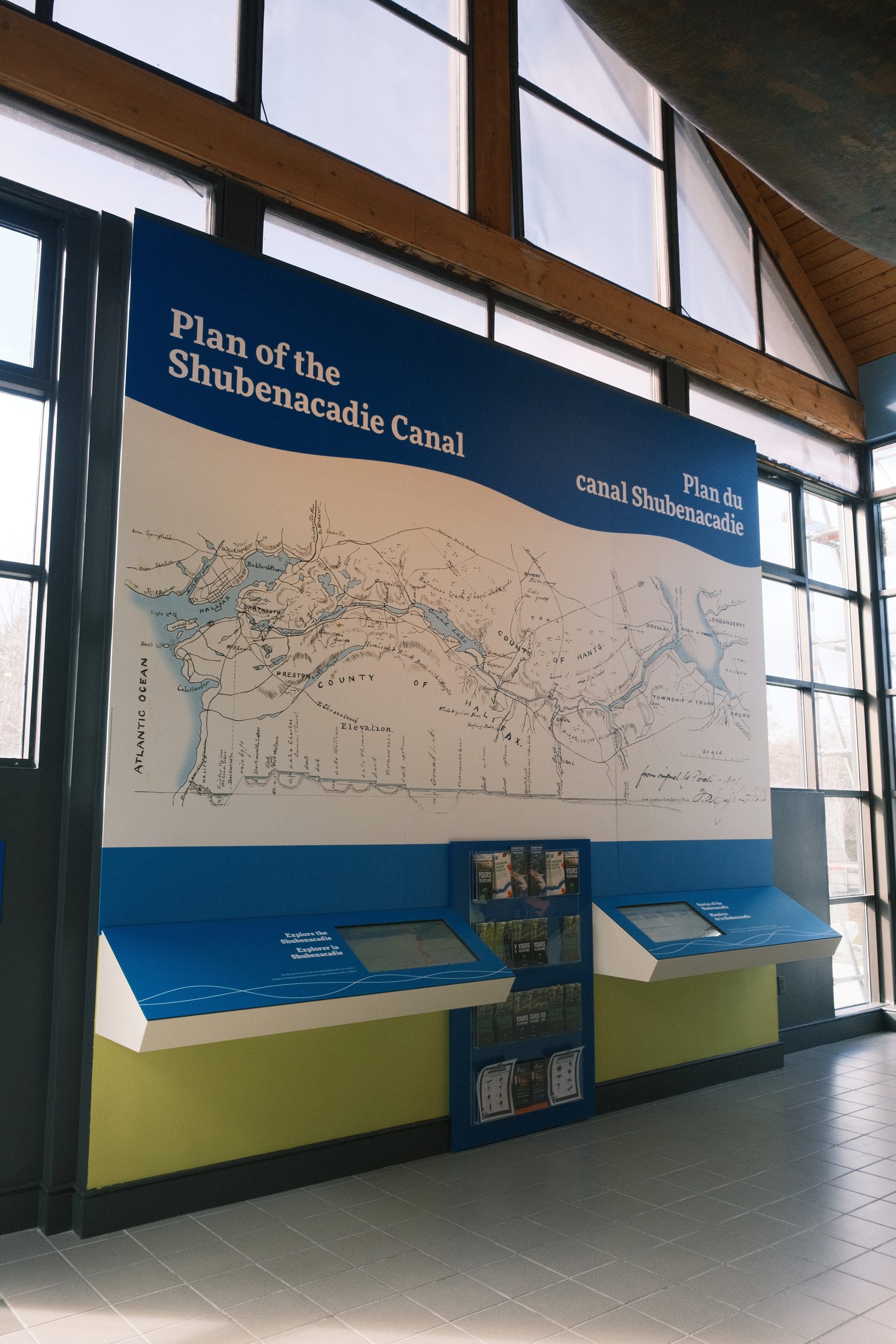
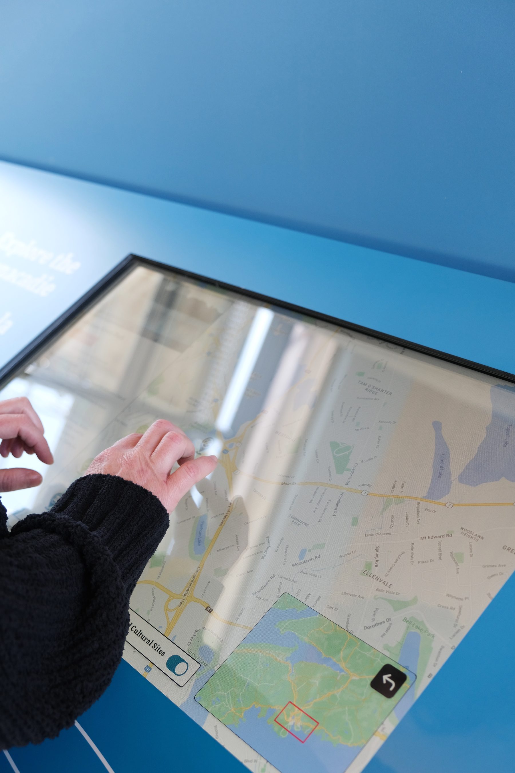
The hall it sits in is emphatically physical: a working lock model runs down the middle of the room for children to operate, with interpretive panels along the stone walls and the printed plan of the canal filling the far end. My scope was the digital side of that exhibit — two applications on two touchscreens set into the base of that plan. One is a map you explore. The other carries the waterway's videos and articles, and what it offers changes with the place you have selected next door. The brief named a plain audience and a plain target: general tourists, children and elderly visitors, in interactions of about five minutes.
02 — Design Approach
Fitting 114 kilometres onto one screen.
The waterway runs the width of the province, and almost every stretch of it carries something worth stopping on. The points of interest alone spanned six categories in the brief — Mi'kmaw place names, regional and provincial parks, trails, museums and cultural sites, and the locks themselves. The problem was never a shortage of content. It was that a drop-in visitor gives an exhibit about five minutes, and a map dense enough to hold all of that is a map nobody reads.
The approach was to let geography do the indexing, and to wire the two applications together rather than run them in parallel. The map stays a map: filter it down to what you care about, find a place, touch it. Selecting that place is what changes the stories screen — the videos and articles it offers follow your position on the map instead of sitting in a separate menu. Splitting locating from reading is what let the map stay legible; every paragraph that would have crowded it had somewhere else to live, and no visitor had to work out how the two screens related.
The map had to stay a map. The moment it turned into a menu, the geography stopped doing any work.
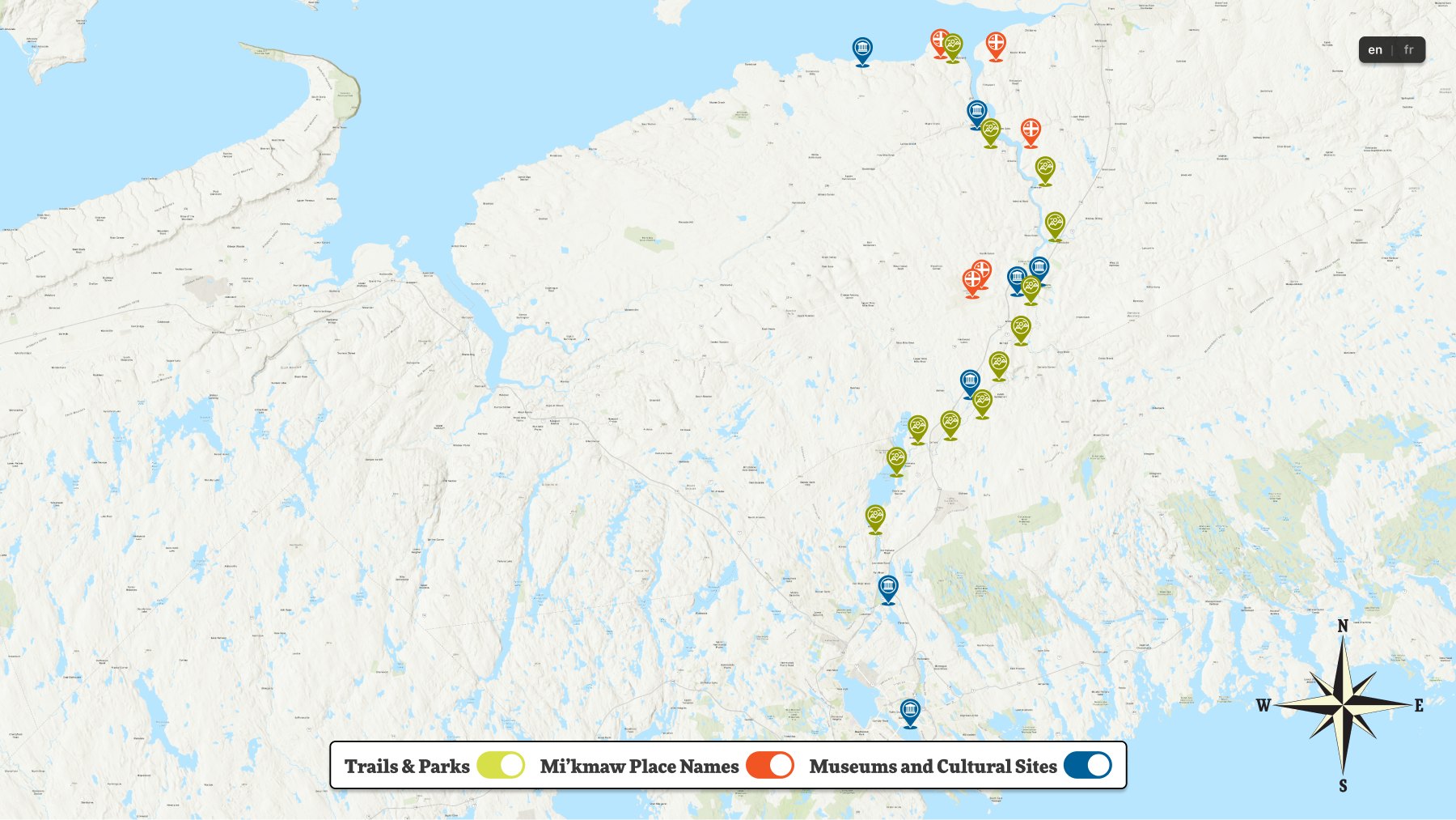
What each marker holds depends on what kind of place it is. A Mi'kmaw place name opens onto the name itself and what it means — Maqtewapskek, "at the black rock" — with a note that these names describe features of the landscape, historical events and important resources, and worked as a mnemonic device to help people find their way. A destination opens onto the practical: address, driving distance and time, season, amenities and accessibility, who operates it. Same map, two very different registers, because a visitor planning an afternoon and a visitor learning the history of the river are not asking the same question.
Because a five-minute interaction rarely ends at the exhibit, locations carried a QR code — a way to leave with the trail, park or article you had just found rather than trying to memorise it. And the map's "You Are Here" marker does double duty: it locates the Fairbanks Centre on the waterway, then points visitors back out to the other interactive exhibits in the room.
03 — Designing for the Floor
Bilingual, audible, and legible from a standing start.
Everything in the centre is bilingual, so the screens were designed that way from the field level up rather than translated afterwards — every title, description, address and QR destination existed in both English and French, switched by a toggle carried across both applications.
Reading a screen standing up in a public hall is its own constraint. Articles could be played as audio rather than read, with the control changing state as it played. Videos ran with captions. Body copy was held to a 40–60 character measure so a paragraph stayed scannable at distance, and a late revision swapped the date style to a heavier italic purely because the original did not hold up on the screens themselves. Touch targets and UI scale were revised for the same reason — what reads comfortably on a desk does not necessarily read on a wall-mounted panel at arm's length.
Idle screens were treated as part of the design rather than a blank state: when nobody was using them, each application animated a short prompt — Interact with the map and learn about important places, Interact with articles and videos to learn interesting facts — so the invitation was visible before anyone touched anything.
04 — Handing It Over
An exhibit the Commission could keep current.
Nothing on these screens is fixed. The layouts are templates the backend fills from a database, so the design could never be a set of finished pages — it had to be a set of slots that still hold when the content changes. The components were built against their worst cases rather than their best: a card proven with a heading that runs past five lines, a body held to a 40–60 character measure, a hero image at a fixed 655 × 288, and a master component per card type so spacing and type didn't drift as entries were added.
That also means an installation which can only be updated by the people who built it starts going stale the day it opens. The first piece of work against that was a media library concept for the Commission's own staff — a dashboard for adding and ordering the waterway's videos and articles, filtering by type, and capturing the metadata the public cards actually display: publication date, author or publisher, and running time.
The second piece was less glamorous and mattered more. The Commission was supplying content as a spreadsheet, so I marked up the designs against their columns — Title, Subtitle, Label, Author, Reading Time, Hero Image, Description, Address, Distance, Season, Amenities, Operator, QR Code, each flagged where it needed both languages — so it was unambiguous which cell landed in which slot on screen, and at what image dimensions. The developer handoff carried the same discipline: annotated interaction notes on every state, master components for card type and spacing, and a dated log of revisions.
05 — Reflection
A map is a better index than a menu.
Giving each screen a single job — one to locate, one to go deep — solved more than the density problem. It meant neither screen had to compromise: the map could stay uncluttered enough to scan in seconds, and the stories could run long enough to be worth sitting with. The screens also had to know their place. They sit inside a much larger physical exhibit, so anything the wall already said well didn't need saying again on a screen — the digital pieces earned their space by going further than print could, not by repeating it.