Squamish Adventure Centre
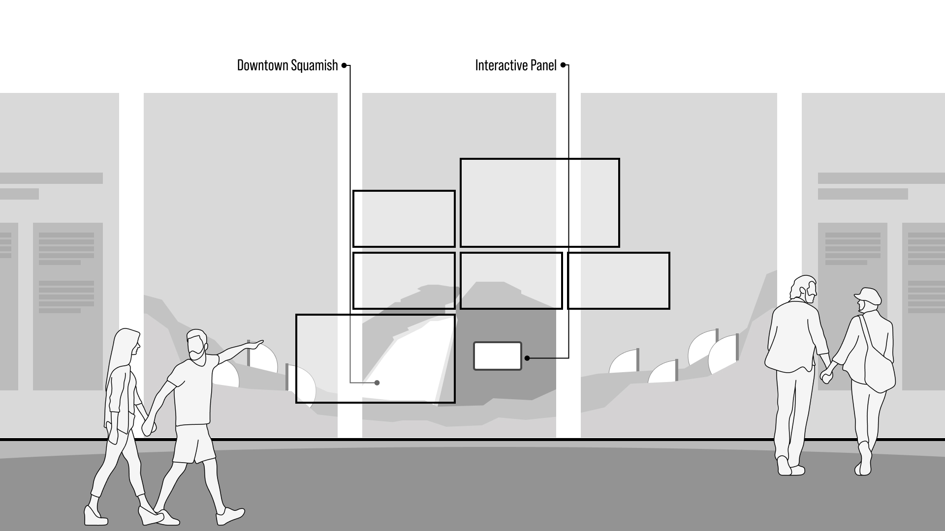
An interactive video wall installation for the Squamish Adventure Centre — letting visitors explore the region's stories, destinations, and outdoor activities through a touch-driven, non-linear experience.
Role
Experience Designer
Client
Squamish Adventure Centre
Type
Interactive Installation
Location
Squamish, BC
01 — Overview
An entry point into a region that has a lot to offer.
Squamish sits at the intersection of ocean, forest, and mountain — a destination with a depth of experience that's hard to communicate in a brochure. The Adventure Centre needed an installation that could hold a visitor's attention for more than a glance, communicate the breadth of what the region offers, and do it in a way that felt as active and exploratory as the destination itself.
The result was a large-format interactive video wall — a touchscreen-driven experience that let visitors navigate stories, places, and activities across the territory at their own pace, following what interested them rather than a predetermined path.
02 — Design Approach
Non-linear by design.
Visitor centres see an enormous range of people — families, solo travellers, seasoned outdoor enthusiasts, first-time visitors. Designing a single linear experience that worked for all of them wasn't viable. The architecture needed to support browsing: touch a location, go deeper, come back, explore something else.
The interaction model was built around regional map navigation, with touch targets surfacing video content, photography, and activity information. The visual language drew from the landscape itself — bold, outdoor, high contrast — to feel continuous with the experience of actually being in Squamish rather than a departure from it.
The best visitor centre experience doesn't feel like a visitor centre — it feels like the beginning of the trip.
03 — Reflection
Designing for dwell time.
One of the consistent challenges in visitor experience design is getting people to stop. Most installations are glanced at — a few seconds before moving on. The non-linear structure of this installation was designed specifically to reward stopping: the more you explored, the more there was to find. Building that quality of discovery into an interactive system is a design problem worth solving carefully, and it's one I've returned to on several subsequent projects.