RecycleBC
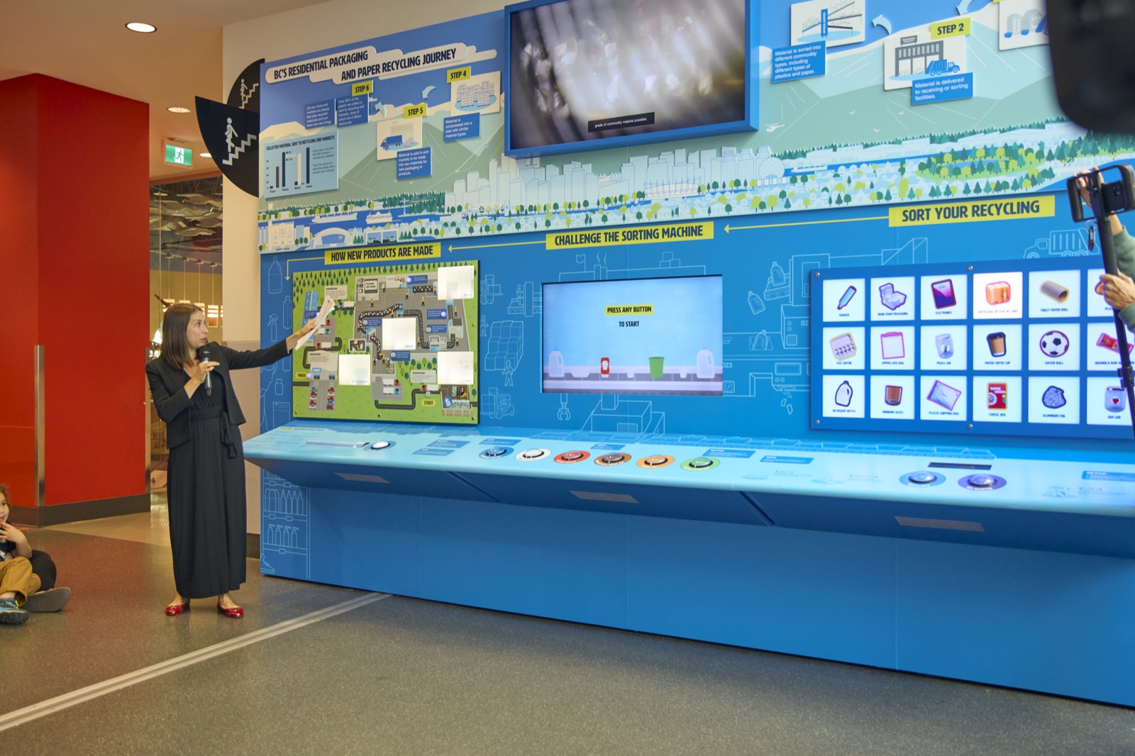
End-to-end design of a three-station interactive exhibit at Science World that follows the lifecycle of a recycled laundry jug — from household bin to brand new product — making environmental education hands-on, competitive, and fun for kids and families.
Role
Sole Designer
Client
RecycleBC
Year
Opened Sep 24, 2025
Venue
Science World, Vancouver
01 — Overview
From bin to brand new
RecycleBC came to us with a clear goal: strengthen the message around recycling and make it genuinely engaging for young audiences. The brief called for three interactive touchpoints embedded within a larger exhibit structure — a diorama at the top, and three stations below — all tied together by a central narrative thread.
That thread was a laundry jug. One recycled laundry jug, followed from the moment it enters the bin to the moment it becomes something new. Everything in the experience — the games, the map, the scoreboard — was designed to make that journey tangible. The client framed it simply: "Follow the amazing journey of recycling — from your home to a whole new life."
The exhibit also served a larger strategic purpose: introducing soft plastics recycling to the public before the program launched across Metro Vancouver on February 16, 2026. Science World became an early education platform — giving families a hands-on preview of what soft plastics recycling looks like and why it matters, months before blue bins across the region would accept them.
02 — My Role
One designer, all three stations
I was the sole designer on this project from start to finish. That meant owning everything visual and interactive: UX, interaction design, game design, content writing, and graphic design — including adapting the client's existing brand into exhibit-ready graphics. I worked closely with fabrication and a small external team who assisted with graphic polish on Station 3 due to time constraints.
Design
UX flows, interaction patterns, visual system, layout, typography, and colour — applied consistently across three distinct station formats.
Content
Wrote all exhibit copy and educational content based on client-supplied materials. Balanced accuracy with clarity for a mixed-age audience.
Game Design
Designed the rules, difficulty curve, and pacing for Stations 1 and 2 — with the goal of 5-minute max playtime to keep throughput high.
Brand Integration
Took RecycleBC's existing brand and adapted it for physical exhibit graphics, UI, and the overhead scoreboard display.
03 — The Experience
One journey, three stations
The exhibit lives on the second floor of Science World, adjacent to the staircase connecting floors one and two. To capture attention the moment visitors arrive, a large graphic on the right wall acts as a visual hook — drawing the eye up from the stairs and into the space before anyone has read a word.
Once inside, the experience reads right to left. Directional arrows guide users through the journey in sequence: starting at Sort Your Recycling on the right, moving through Challenge the Sorting Machine in the centre, and ending at How New Products Are Made on the left. The diorama above and the overhead display tie the full wall together as a single coherent installation.
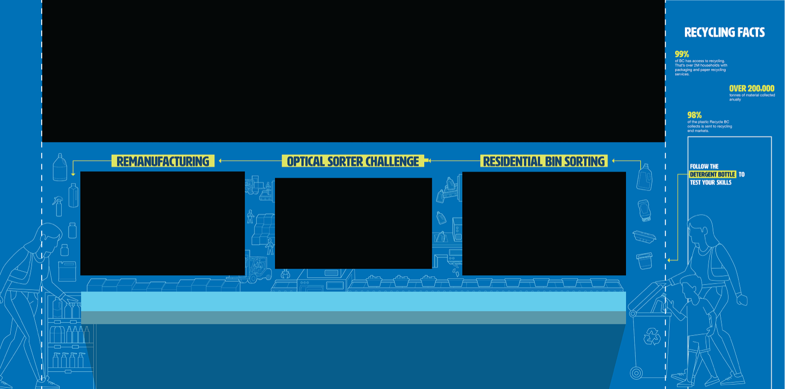
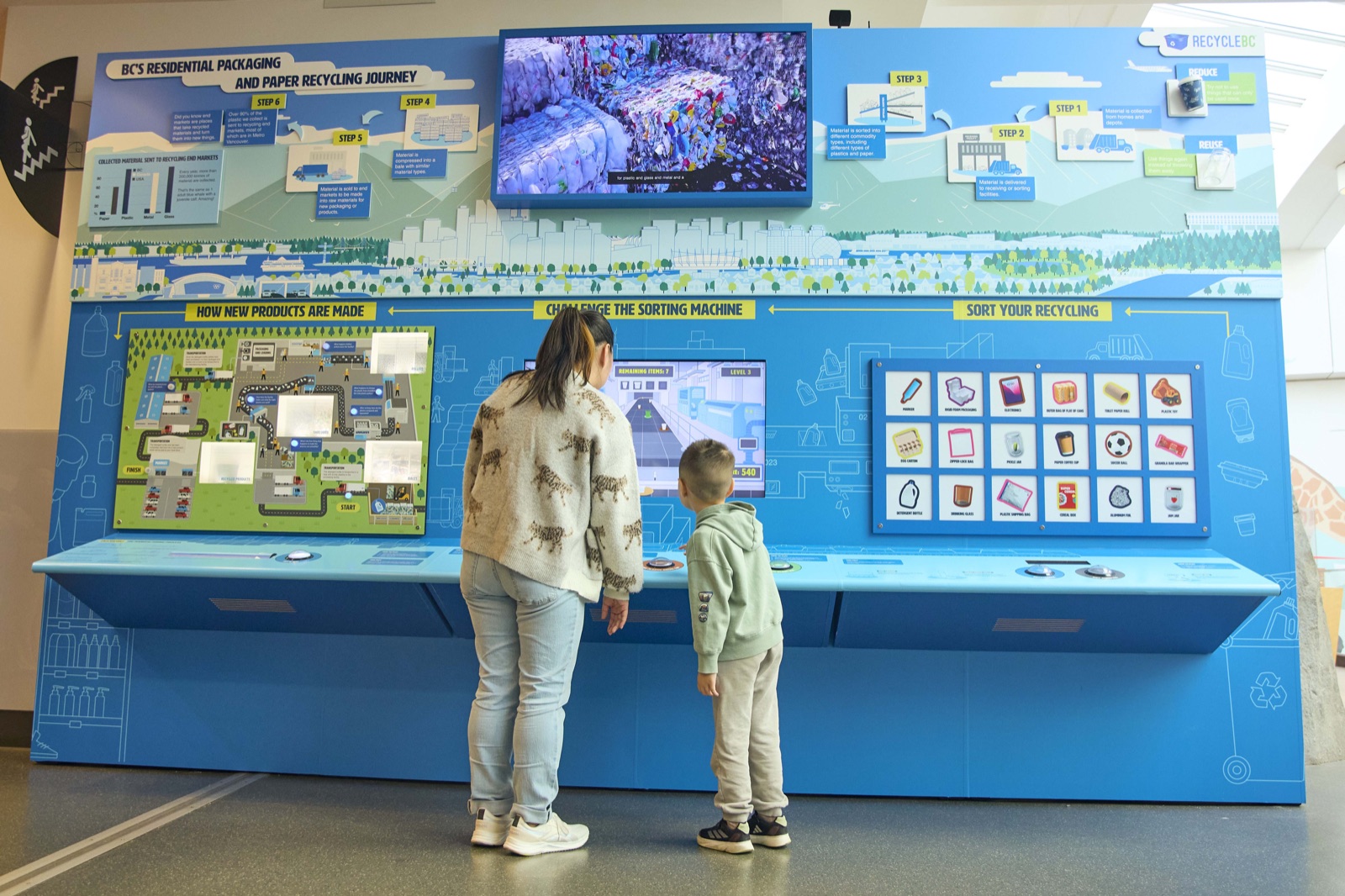
Overhead, a large display screen rotates between contextual animations and a live scoreboard — giving friends a secondary objective beyond just learning, and keeping energy up across the space.
Station 1 — Sort Your Recycling
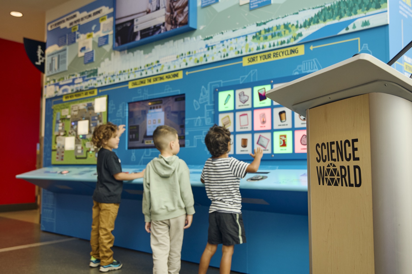
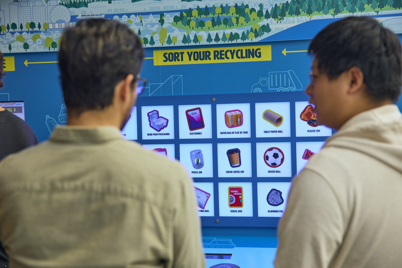
Users are presented with a series of product images and asked to sort them into the correct recycling categories. The challenge was building a product list that was both accurate and visually clear enough for children to parse quickly. Categories had to map to how RecycleBC actually classifies materials — not simplified guesses.
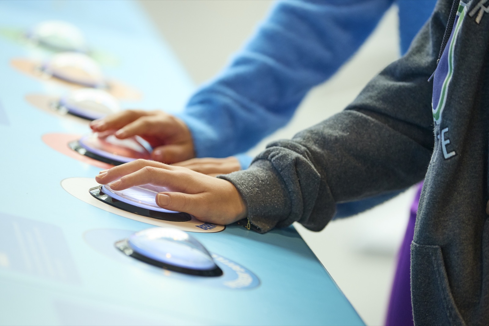
The sorting mechanic needed to feel physical and tactile despite being a screen interaction, and had to be learnable in seconds with no instructions read.
Station 2 — Challenge the Sorting Machine
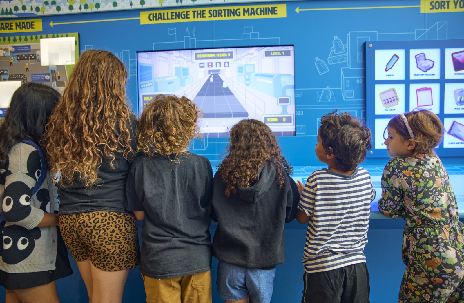
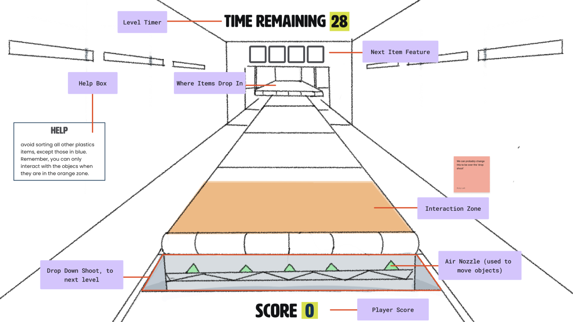
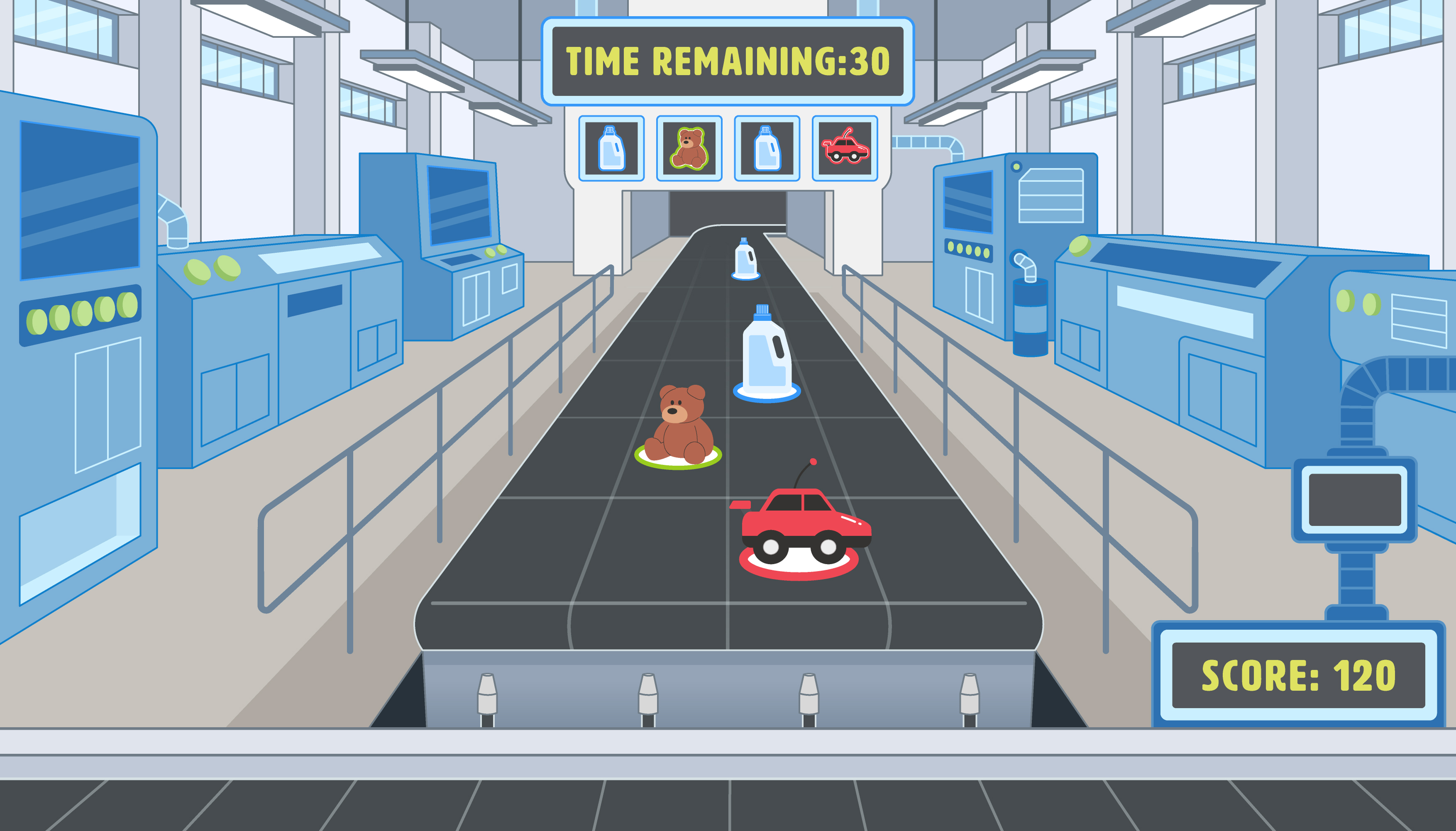
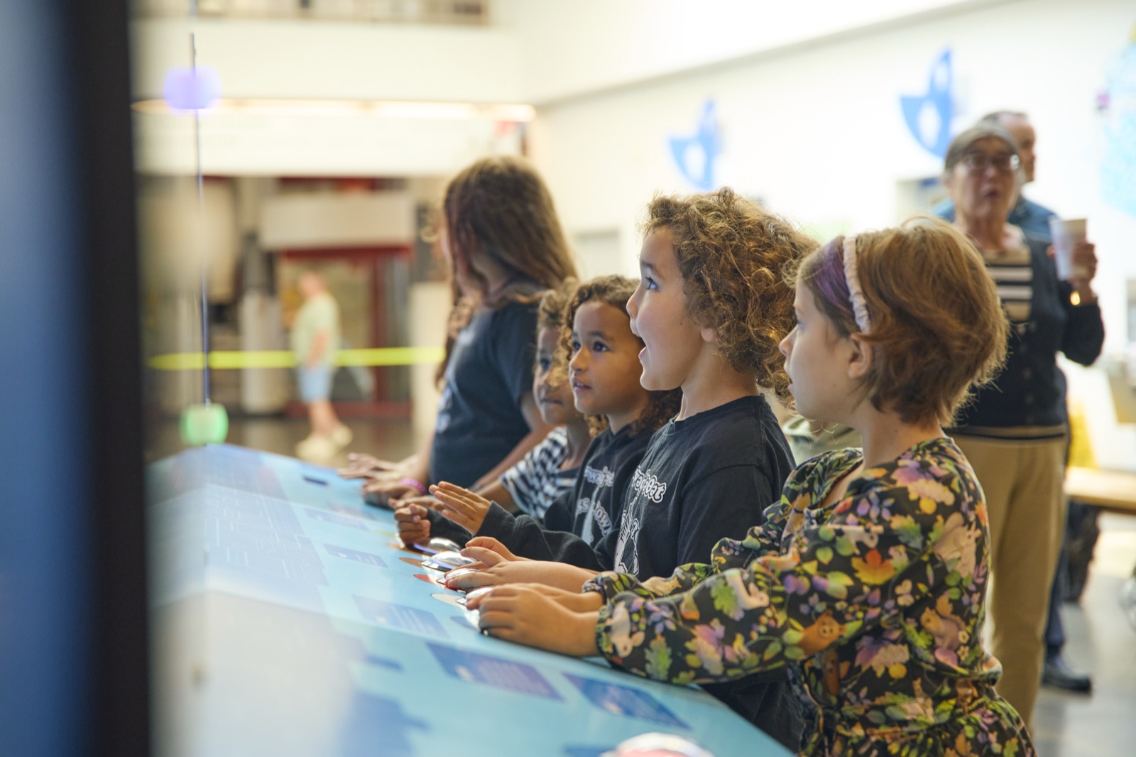
This was the most technically and creatively challenging station. Users compete against a sorting machine — inspired by real recycling facility equipment — to see if a human can sort faster. The game needed to feel grounded in reality, so we drew directly from how materials are sorted at actual facilities.
The core design challenge: how do you make a competitive game feel fair, educational, and completable in under five minutes — for a seven-year-old?
The difficulty escalates across rounds: the pace increases, categories become more granular, and the machine gets faster. But the game is designed so that the first round is always winnable — the goal is to hook users into wanting to try again, while the learning happens almost incidentally.
Perspective & interaction
Designed the camera angle and spatial layout to match how users actually see a sorting conveyor — side-on, items moving left to right — to reinforce the real-world reference.
Pacing
Rounds capped at 5 minutes maximum to maintain throughput. A group could rotate through and still feel like they got a full game experience.
Station 3 — How New Products Are Made
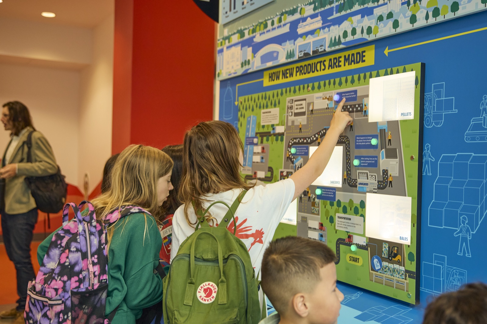
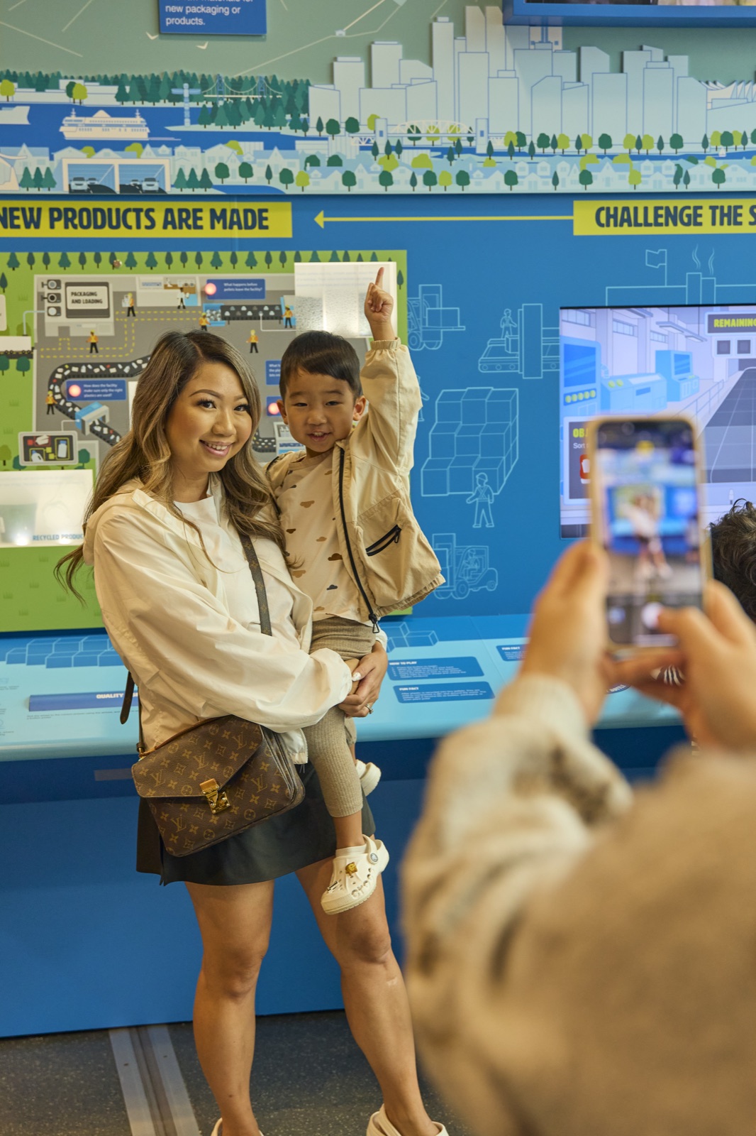
Once materials have been sorted and baled in Station 2, they're "shipped" to Station 3 — a physical map-based exploration. Users move through waypoints along the map, answering a question at each light node. At key moments, a shadow box reveals the material's transformation at that stage of the journey.
This station takes a different approach to engagement: instead of competition, it's discovery. Information and step descriptions are available at every node, keeping the game challenging but never impossible. The revelation mechanic — lifting a flap or pressing a button to reveal the shadow box — gives kids something physical and satisfying at each stop.
04 — Design Process
Grounding the experience in reality
The brief called for fun and engaging — but the client was equally clear that accuracy mattered. RecycleBC's credibility depends on the information being right. So the research process started with the source material: how the facilities actually work, what the real sorting categories are, and where misconceptions typically occur.
The numbers behind the exhibit are genuinely compelling: over 90% of plastics collected by RecycleBC go to recycling end markets, and 99% of that material is processed locally in Metro Vancouver — turned into pellets that become bottles, packaging, plant pots, and more. The design challenge was making those facts feel real rather than abstract.
From there, design moved outward: how do we take that accurate information and build interactions around it that don't feel like a quiz? The answer was to make the process physical — put users in the role of the machine, the sorter, the explorer — rather than a passive reader.
The exhibit was never meant to lecture. The information lives in the environment — in the labels, the shadow boxes, the categories — and users absorb it by doing, not by reading paragraphs.
05 — The Glue
The scoreboard as social layer
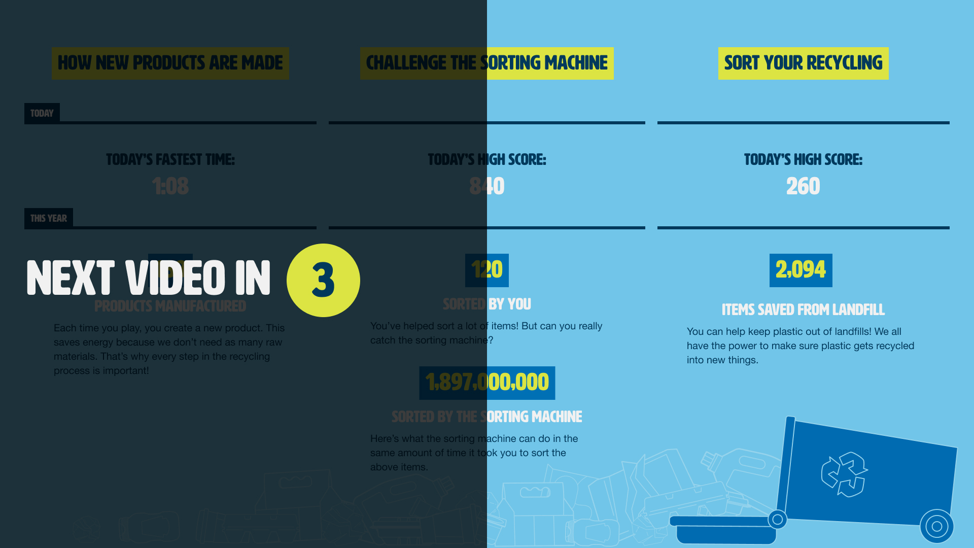
The large overhead display does two things: when idle, it plays RecycleBC's marketing content as required by the brief. But during active play, it rotates to a live scoreboard — pulling scores from Station 2 and displaying them for the whole room.
This turns a solo educational activity into a social one. Friends compete. Kids want to beat the score they saw while they were waiting. The scoreboard creates a secondary objective that extends engagement beyond any single play-through, and it gives the exhibit a presence that's visible from across the room — drawing people in before they've even read a word.
06 — Outcomes
What shipped
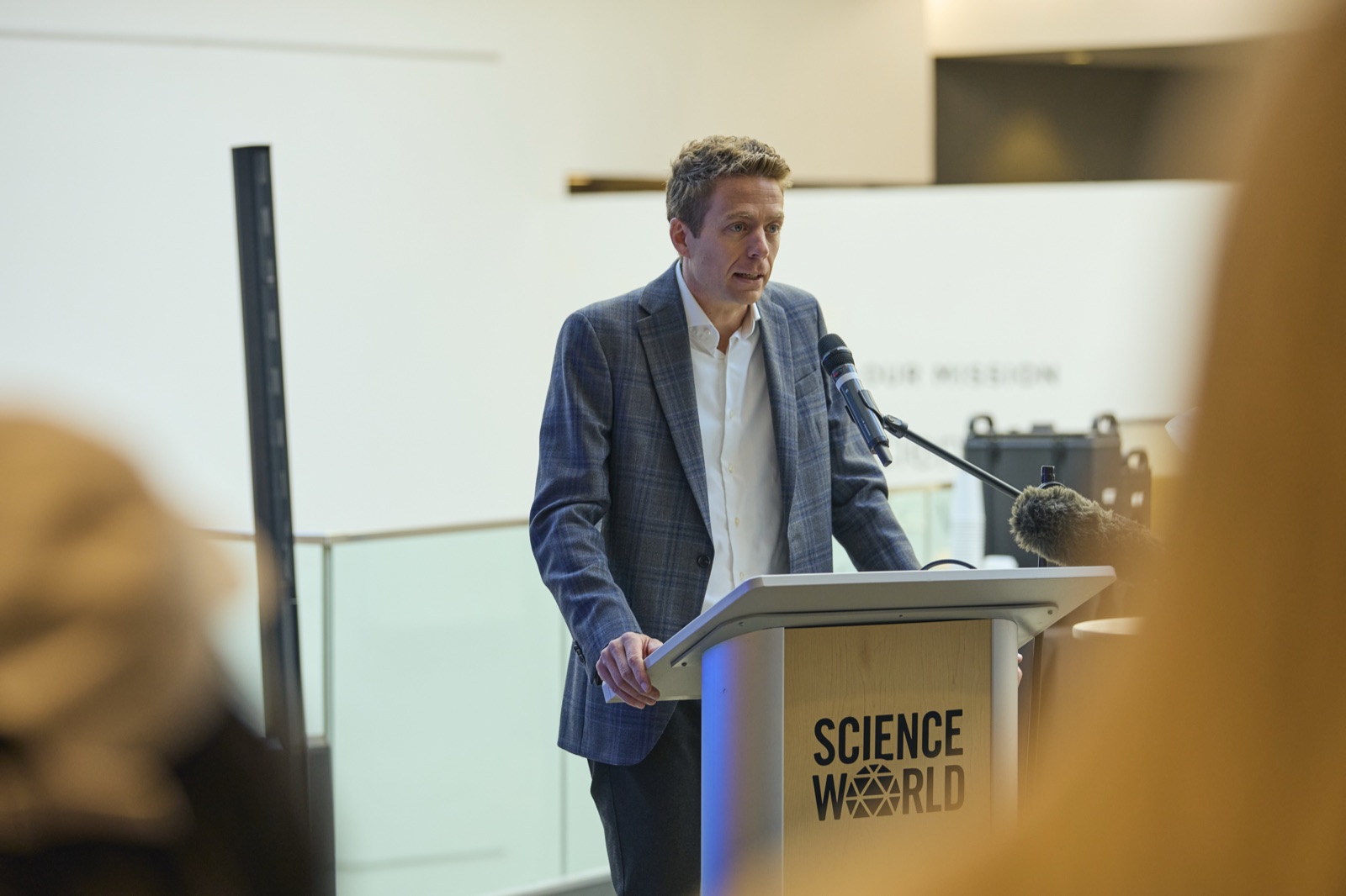
The exhibit opened at Science World on September 24, 2025 and has logged over 66,000 sessions across all three stations since — averaging more than 4,000 sessions a month. Usage across the three stations is remarkably even (Station 1: 1,399 · Station 2: 1,361 · Station 3: 1,357 in March 2026), which suggests the experience holds attention all the way through rather than dropping off after the first touchpoint.
The exhibit also delivered on a larger brief: it served as the public introduction to soft plastics recycling — a new program that launched across Metro Vancouver on February 16, 2026. Tens of thousands of families encountered the concept here first, at Science World, before it arrived at their door.
07 — Reflection
Retrospective
Designing for physical environments is fundamentally different from screen design — and this project pushed me to think about time, space, and bodies in ways that digital work rarely demands. The 5-minute playtime constraint was a forcing function: every design decision had to justify itself against the clock.
Working as the sole designer on all three stations also meant making decisions in isolation that would normally involve a team. I had to be disciplined about consistency — the three stations needed to feel like one experience despite having very different interaction models. The shared visual language and the narrative thread of the laundry jug were what held it together.
If I were to revisit this project, I'd invest more time in observational research with kids at the prototype stage. Some of the UX refinements that came from watching real users interact with the stations could have been caught earlier — but the compressed timeline made that difficult. It's a discipline I've brought forward into every physical project since.