Inspiring Local Champions
· Nominated for the Heritage BC People's Choice Award 2026
A spatial redesign of a community centre anchored by three digital exhibits: an interactive timeline wall, an AI-powered champion game, and a rebuilt hall of fame, all telling Terry Fox's story through the City of Port Coquitlam's identity.
Overview
A lobby with no story. A city with a legacy worth telling.
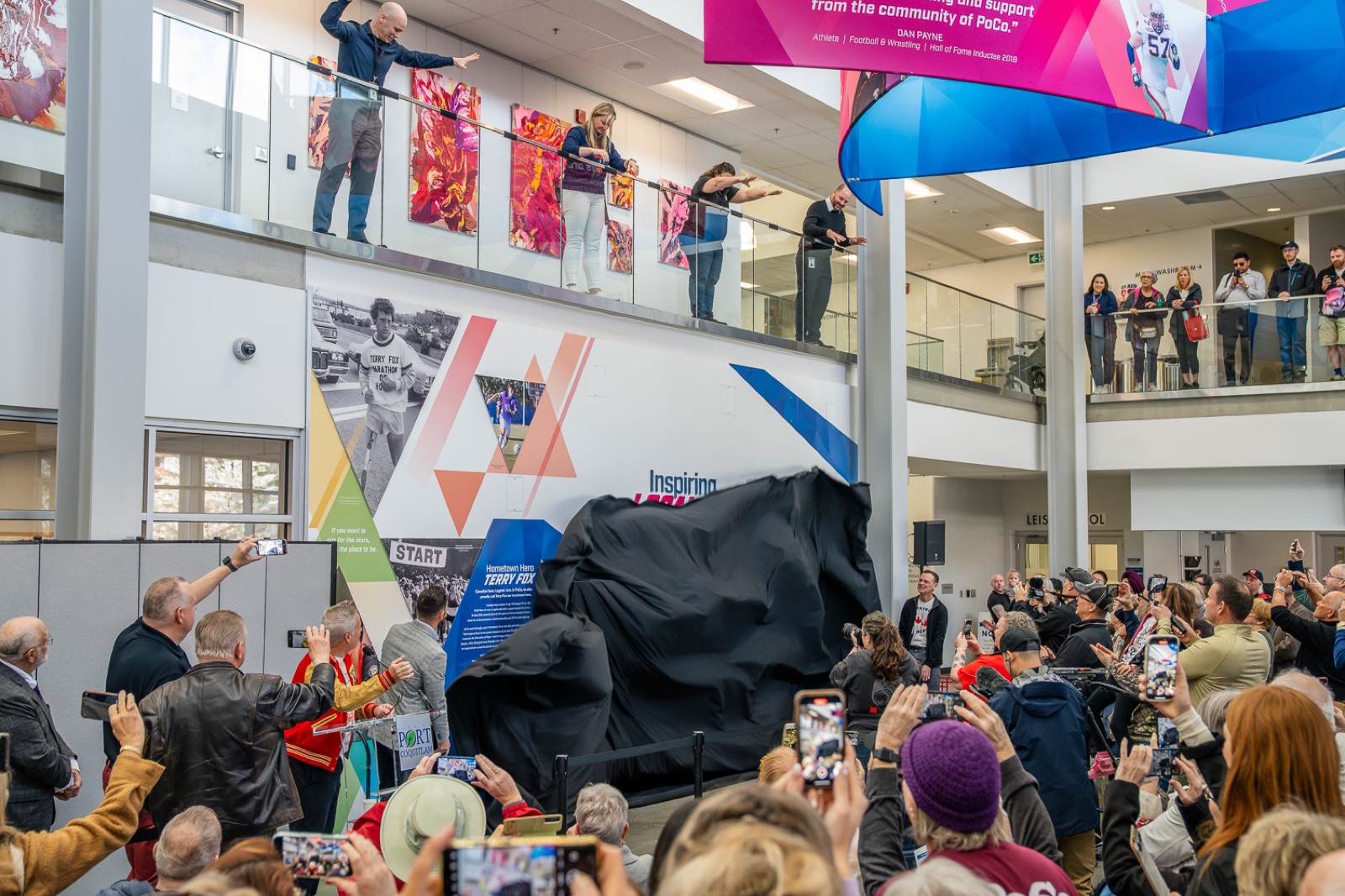
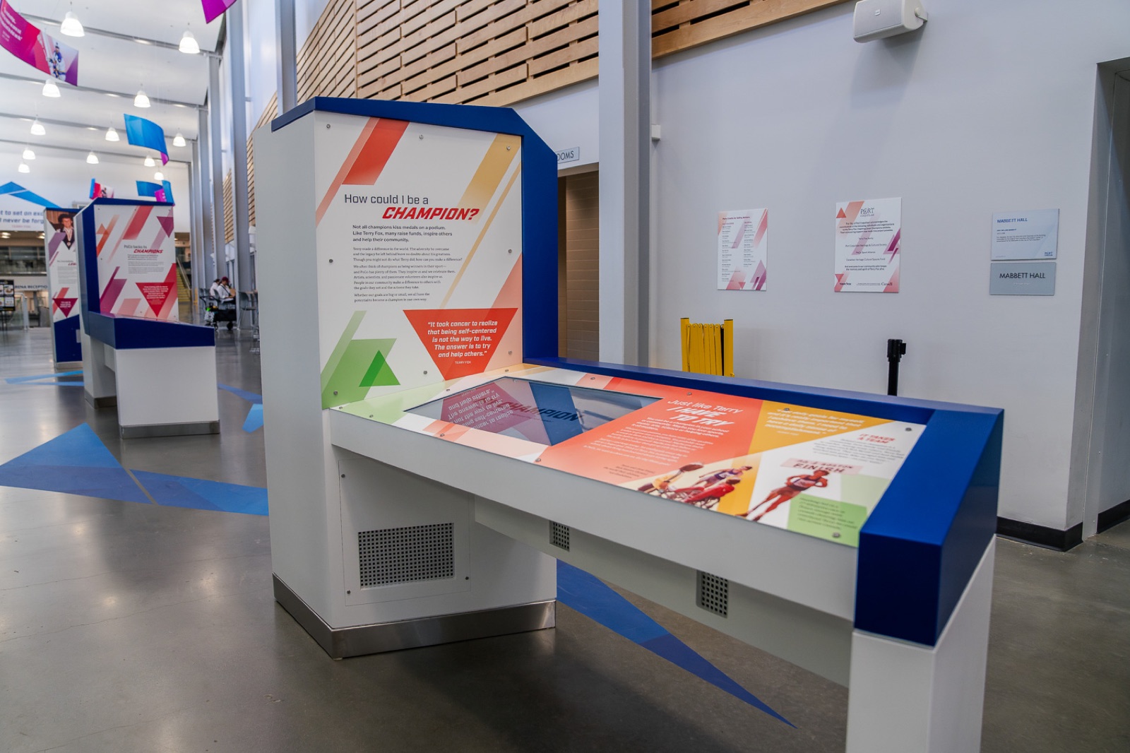
The City of Port Coquitlam commissioned a redesign of an underused lobby and hallway in a local community centre, timed to celebrate the Terry Fox Run. The brief treated Terry Fox's story as a lens rather than a monument: a way to reframe what it means to be a champion. The guiding idea was that anyone can be one, and being one doesn't mean always being the best.
I was the sole designer on the project, covering UX, UI, and game design, while the broader team handled development, fabrication, and installation. It shipped as three connected exhibits: a physical timeline wall tracing 10 pivotal moments in Terry Fox's early life, a touchscreen experience called My Champion that turns each visitor's idea of a champion into a character, and a full overhaul of the city's Hall of Fame that brought decades of local athletic history up to date.
The Problem
One game that had never been built before. Two exhibits that needed rescuing.
The space was a blank slate: a lobby and hallway with no identity. Each exhibit came with its own constraint, but My Champion was the one with no precedent to work from.
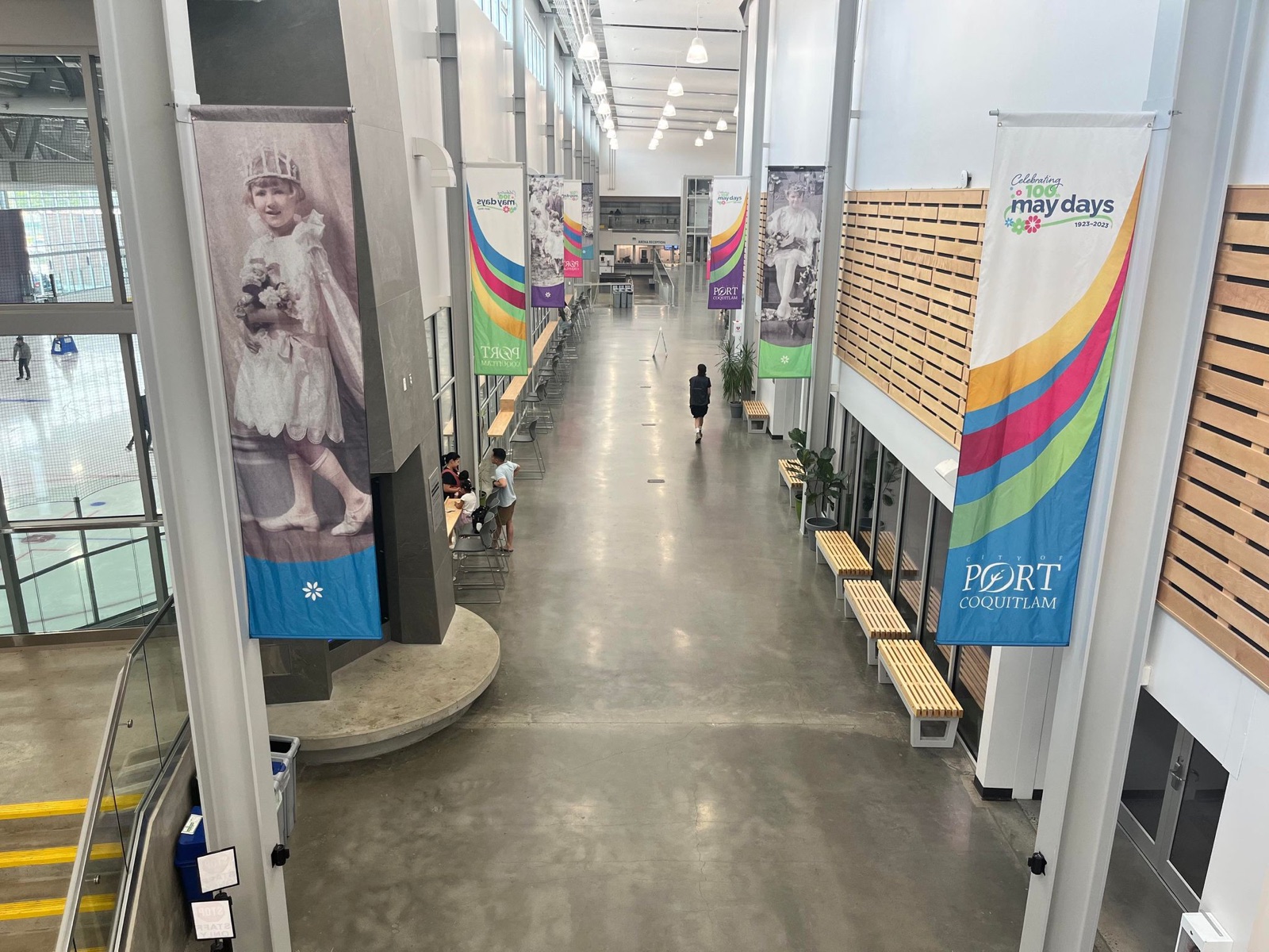
My Champion: making it personal, not a form
The brief called for an avatar creator where visitors build characters embodying the qualities of a champion. The concept was sound; the execution was the problem. An avatar picker that lets you select "hard-working" and "team player" from a list meets the brief and still feels like paperwork. What we needed was an experience where every choice reflected something about the person making it, so the champion they ended up with felt like theirs.
The other two arrived with different constraints. The Hall of Fame ran on legacy software that could no longer be maintained, so it needed a full rebuild and a content model city staff could manage themselves. The Timeline Wall had no touchscreen at all. Visitors interact with it through physical proximity and screen movement, so the design had to teach people how to use it without a single instruction, while blending a digital screen into a printed physical backdrop.
Research & Discovery
What the audience and the space would allow
My Champion was the only exhibit that needed primary research, and it shaped most of what we learned about the audience. Before a single screen was designed, we showed kids illustration styles and asked what they responded to, and put early gameplay prototypes in front of them to validate the interaction model. The other two exhibits were informed by internal research: auditing the existing Hall of Fame content, mapping data structures, and reviewing the physical space with the fabrication team.
The project ran across a structured discovery and kick-off phase, followed by milestone-based sprints. Monthly check-ins with City of Port Coquitlam staff kept the work aligned to client expectations, while biweekly syncs with the fabrication team grounded design decisions in what the space could actually support.
Designing for youth, accessible to all
The primary audience was young people using the community centre, but the experience had to work for adults too. Reading level, visual hierarchy, and interaction complexity were all calibrated to be immediately understandable for a younger user without feeling juvenile to anyone else.
City branding as the design foundation
The primary brand reference was the City of Port Coquitlam, not Terry Fox Foundation assets. That meant translating a municipal identity into something warm and celebratory rather than institutional.
Space that told us what it couldn't do
Site visits surfaced the real constraints: fixed wall positions, foot traffic patterns, lighting, and hardware limitations that directly shaped what each exhibit could be and where content needed to live.
A Hall of Fame with no structure
The existing Hall of Fame lived in a WordPress system with a confusing, image-heavy UI and no meaningful navigation or hierarchy. Athletes, coaches, and rising stars were mixed together with no differentiation, which made it hard to browse, update, or scale.
Design Process
Designing a game that had never existed before.
The project ran in milestone-based sprints across roughly 16 months, with monthly check-ins with the City of Port Coquitlam and biweekly syncs with the fabrication team. Each exhibit had its own design track, but decisions in one kept affecting the others, so the work was never fully sequential.
My Champion
The brief was clear on the destination: an open-ended avatar creator, replayable, and shareable between families and friends. What it left open was the path, and that was the design challenge. Not redefining the brief, but finding the version of it that felt genuine rather than preset.
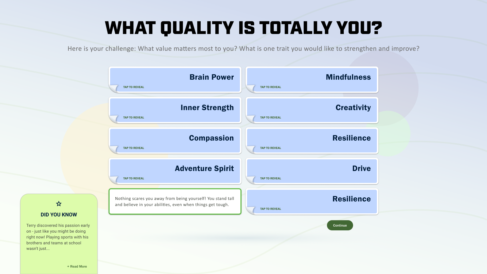
We took three interaction directions to the client: a traditional quiz, a blended concept, and a video game-style GUI. They pushed toward the hybrid, swipe-based and visually driven, so that each answer read as a decision rather than a form field. The arc itself was capped at six questions. We tried both fewer and more, and neither changed the experience enough to justify the tradeoff. The shape mattered as much as the count: three questions to build the character, a review step in the middle where visitors confirm what they've chosen, then three more about personality. The review adds dwell time, so each half had to stay tight. Three at a time also meant a visitor could go back and change an answer without feeling like they'd lost real progress.
The first version put the abstract questions at the front. What values define a champion? What does confidence look like? It didn't land. Abstract questions are hard to answer with nothing to look at, particularly for kids. So we inverted the order and led with the visual choices instead. Once a character is on screen and already starting to feel like yours, the harder questions get easier to answer.
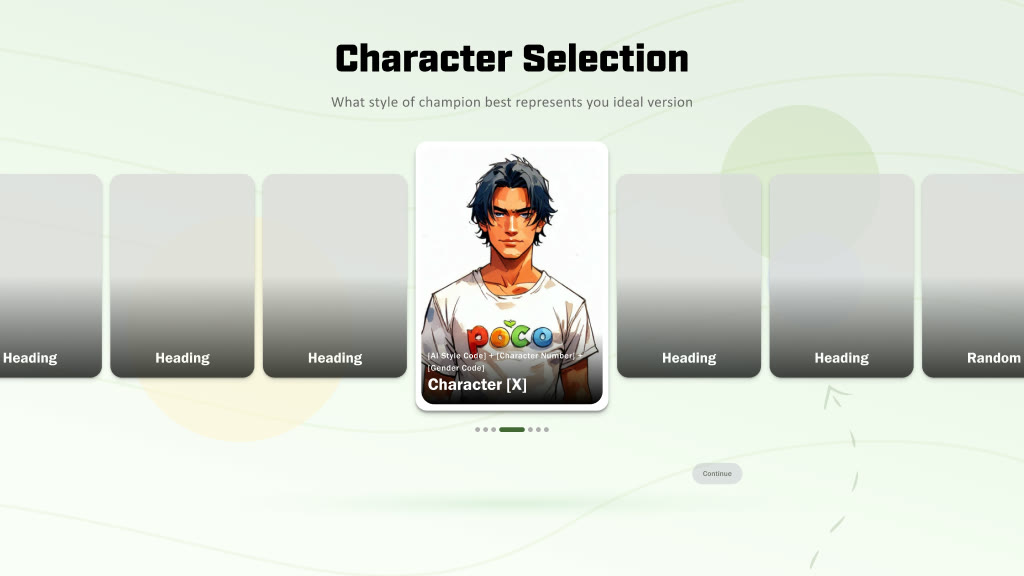
The unisex constraint drove a better solution than any gender question could have. The early instinct was to design a single androgynous character, one figure neutral enough to stand in for anyone. That turned out to be the wrong problem to solve. Instead we pre-created a set of characters with real variety across skin tone, build, and style, and let visitors pick the one that appealed to them. Nobody is represented by a compromise, and nobody is asked to describe themselves. People self-identify however they want, or not at all, and just choose a character they like. The logic comes from video games: the avatar is a representation of you, not you. It takes gender off the table as a question, and it puts a real choice in front of someone in the first few seconds, which is what makes them care about the character that follows.
Four visual directions went into testing: illustrated 2D, anime-influenced, semi-realistic, and Pixar-style 3D. Three filters cut them down. The first was whether a style could hold a gender-neutral read. Anime couldn't, since its conventions resolve a gender read regardless of intent. The second was what the model could be trusted to produce. Semi-realistic was the most demanding of the four: higher fidelity meant more compute, there wasn't enough training data to hold it steady, and the failure mode was the one you least want in a children's exhibit, with characters drifting toward something overly sexualised. The third came from testing with kids, who have strong associations with famous styles and react on sight, love or hate, before they've looked at anything else. A style carrying that much baggage decides how a visitor feels about their champion before the champion exists. What was left was something less common: a hand-drawn comic style, closer to kids' television than to any studio a visitor would recognise. Nothing to work against, and it was what the local model could be trained on and hold consistent across thousands of generations.
Midway through the project we ran moderated one-on-one sessions with kids to test early character directions and a live prototype of the interaction model. We showed them images and asked what they responded to without leading the answer, then had them think aloud while using the prototype, with the screen recorded. Kids cared less about polished character art than we expected, and more about whether the choices felt genuinely theirs rather than picked from a short menu. So we added variety to the character set and rewrote several prompts that were reading as prescriptive. Younger visitors also took to the swipe instinctively while older ones hesitated, which told us the idle screen had to do more to show it could be swiped before anyone touched it.
Getting the content and the model to work together reliably was the longest part of the project. My Champion runs on a local LORA model, a fine-tuned AI running entirely on the machine in the building, and it generates the champion avatar and voice from the visitor's selections. There's no keyboard, so everything has to come from pre-built content: a champion database wide and specific enough that every path through it lands somewhere different. Mapping that out took real time, across user interests, career paths, and personality traits, so it could hold up over thousands of sessions without repeating itself.
The structure underneath is a content decision tree: every question pathway, every answer combination, and the model inputs each one produces. Personality answers don't just pick the Champion Voice quote. They shape the character's face, set the statistics printed on the back of the card, and suggest where those traits could grow. The framework behind it is drawn from established personality research, which gives the model something to stand on even though no visitor ever sees it.
Terry Fox's role took its own round of iteration. An early version ran his story alongside each question as a kind of guide, and it broke the illusion. The narrative was identical no matter what the visitor chose, which undercut the whole feeling of going your own way. Competing narratives dilute agency. What replaced it was lighter: a Did You Know card on each screen showing how Terry Fox would answer the same question. His story next to theirs, not over it.
"Competing narratives dilute agency. Terry Fox's story couldn't run parallel to the visitor's. It had to step back and let them lead."
The output format took a few directions before cards won. Kids already understand cards as game mechanics, as collectibles, and as something worth showing a friend, and sports was already the language of the building. A sports card didn't have to be explained to anyone.
Hall of Fame
The Hall of Fame was a rescue operation more than a redesign. The work was building a content model that could grow to hold athlete profiles, trivia, and award nominations, while dealing with inconsistent records and decades of photography in incompatible aspect ratios.
Timeline Wall
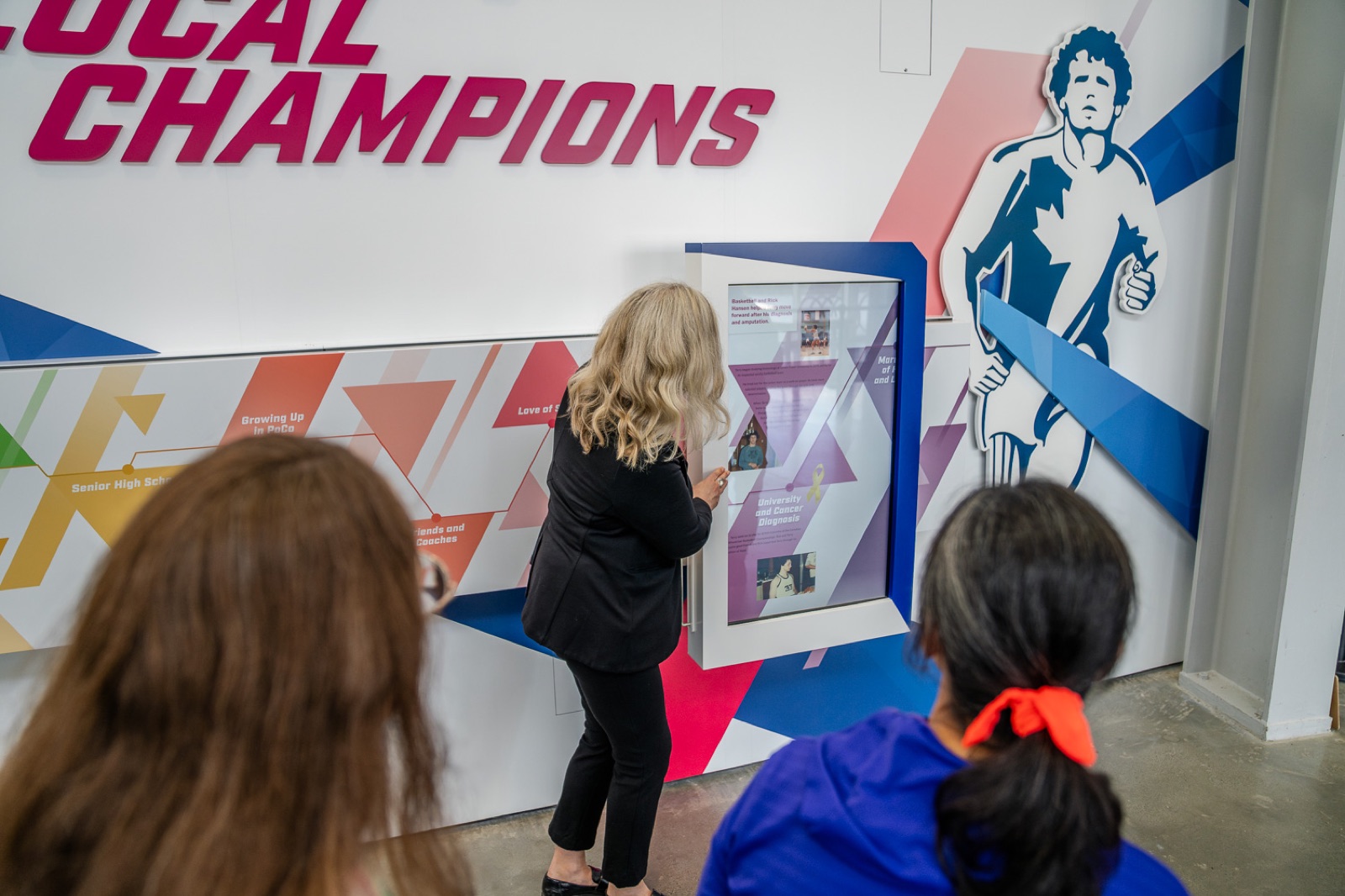
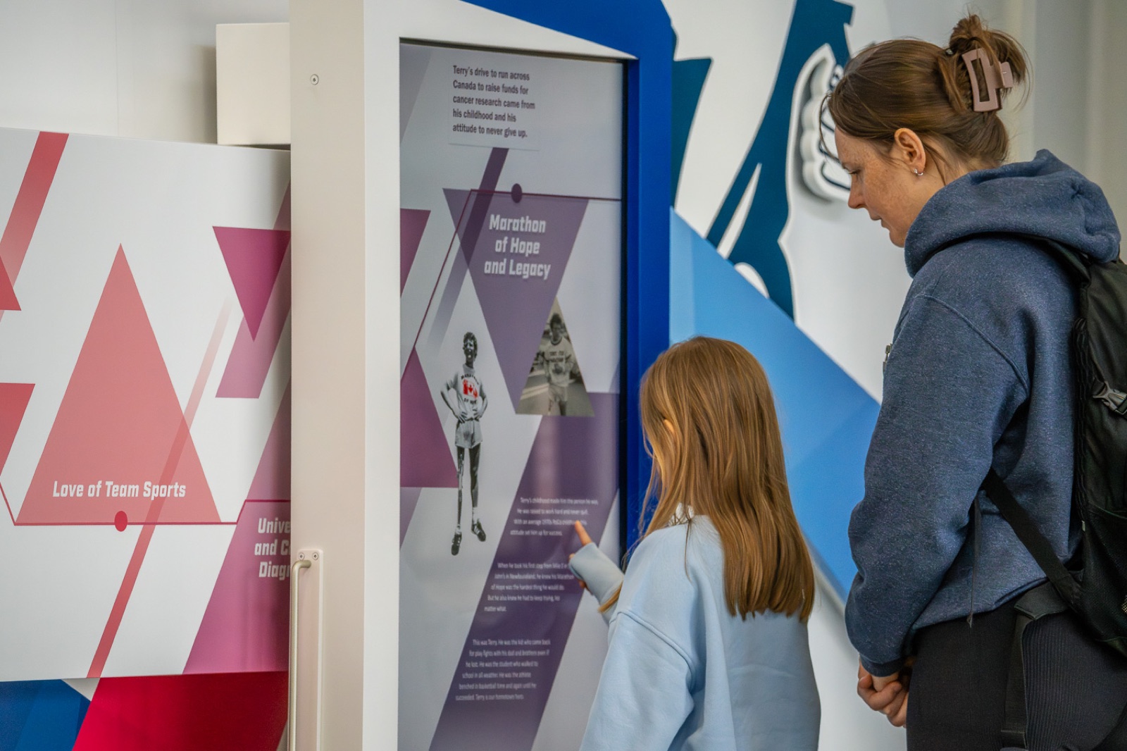
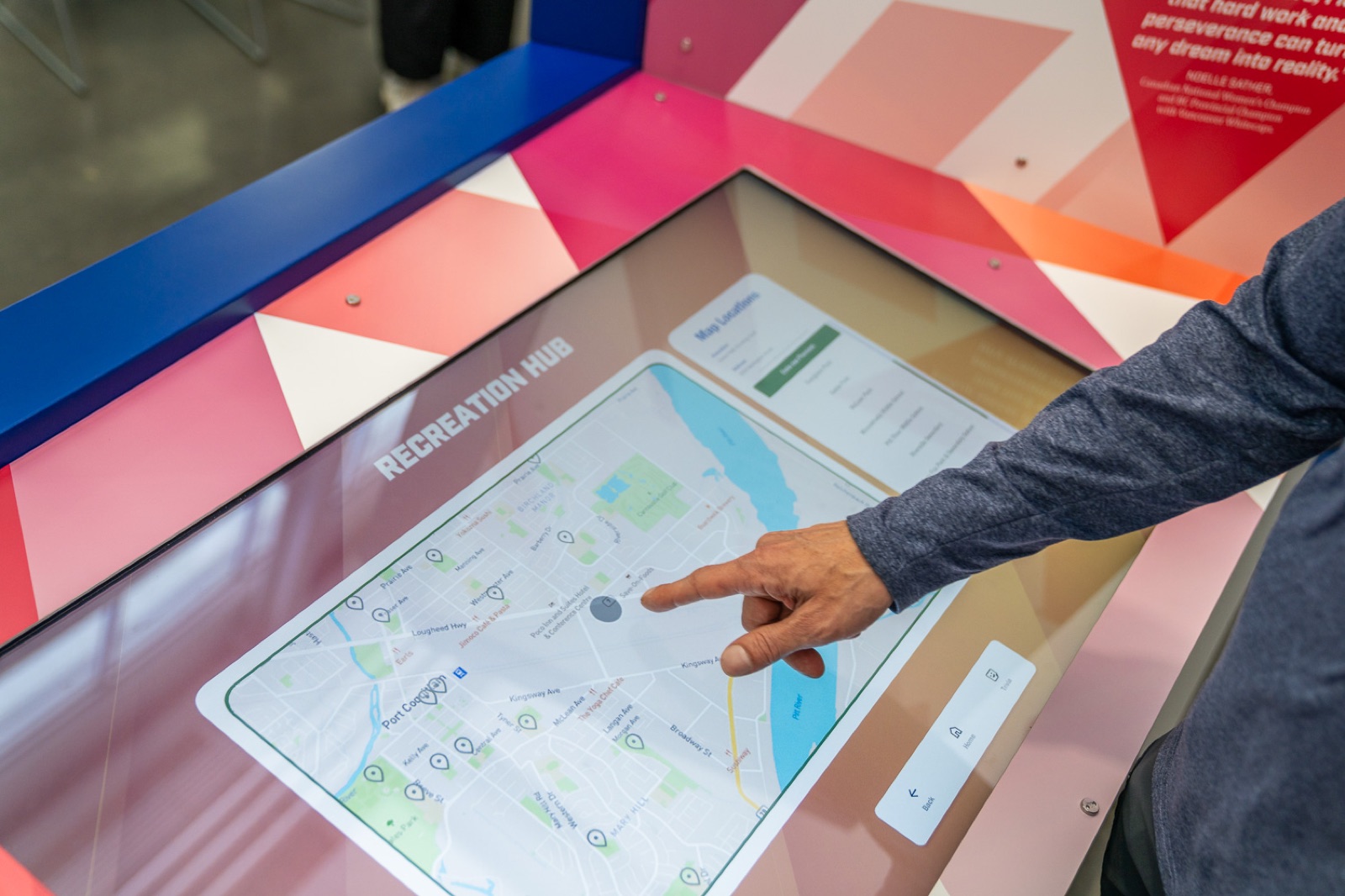
With no touchscreen, visitors move through the Timeline Wall by proximity and by moving the screen itself. That meant teaching the interaction without instructions, and blending a 52" display into a printed backdrop. The hardware wasn't always available to test at full scale, so colour calibration and how the piece reads at size only really resolved on site.
The Solution
My Champion, and the two exhibits built around it.
My Champion
I owned My Champion end-to-end: concept, interaction logic, content, visual design, and user testing, with the dev team handling implementation. I conceived the game model, authored the full question logic and content, defined the look and feel, helped train the AI model on appropriate content, and ran user testing to validate the experience before it went into production.
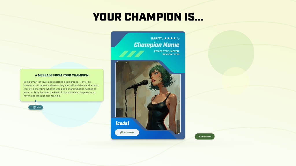
A splash screen pulls people in, followed by the wall of recently generated cards and a short intro to the game. Next they choose from a pre-built set of characters varied across skin tone, build, and style, with a different selection surfaced each playthrough. From there the arc runs in two halves. The first three questions build the character in front of them: the field they compete in, the role they play, the world they play it in. A review step lets them confirm what they've chosen before going further. The last three are about the visitor rather than the character: how they work, how they treat people, what they prioritise when it counts. Those answers produce the Champion Voice, a motivational quote attributed to a real champion whose qualities match the answers given. It's matched by a correlation model built on personality frameworks, so it reads as chosen rather than random.
The model runs entirely on-premise, with no cloud and no external calls. Every avatar and voice comes out of the content decision tree, which maps the visitor's six answers to the right model inputs, so the result is built from their specific path through it. The whole thing works offline, visitor data never leaves the kiosk, and the output stays consistent and safe for a young audience. The model, the content, and the card are one system, and it only holds up when all three are tuned together.
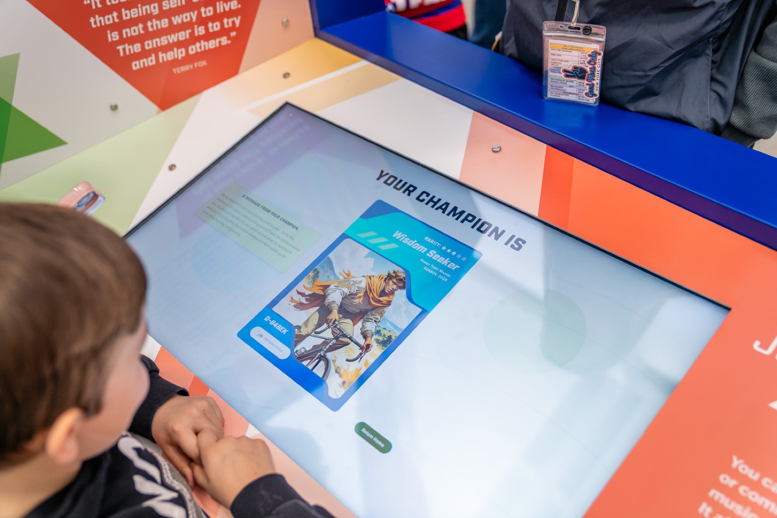
The card is the payoff, the point where six questions turn into something personal and worth keeping. It borrows from sports cards deliberately, with a nod to Pokémon in the flip and in the reason to play again. The front carries the generated character, a name, and a tagline from the Champion Voice. The back carries the stats built from the answers. The reveal is staged: a loading screen runs first, long enough to feel earned without losing a kid's attention, then the card flips into view. One in every 100 comes out holographic. That one is purely for delight, it isn't announced anywhere, it just happens.
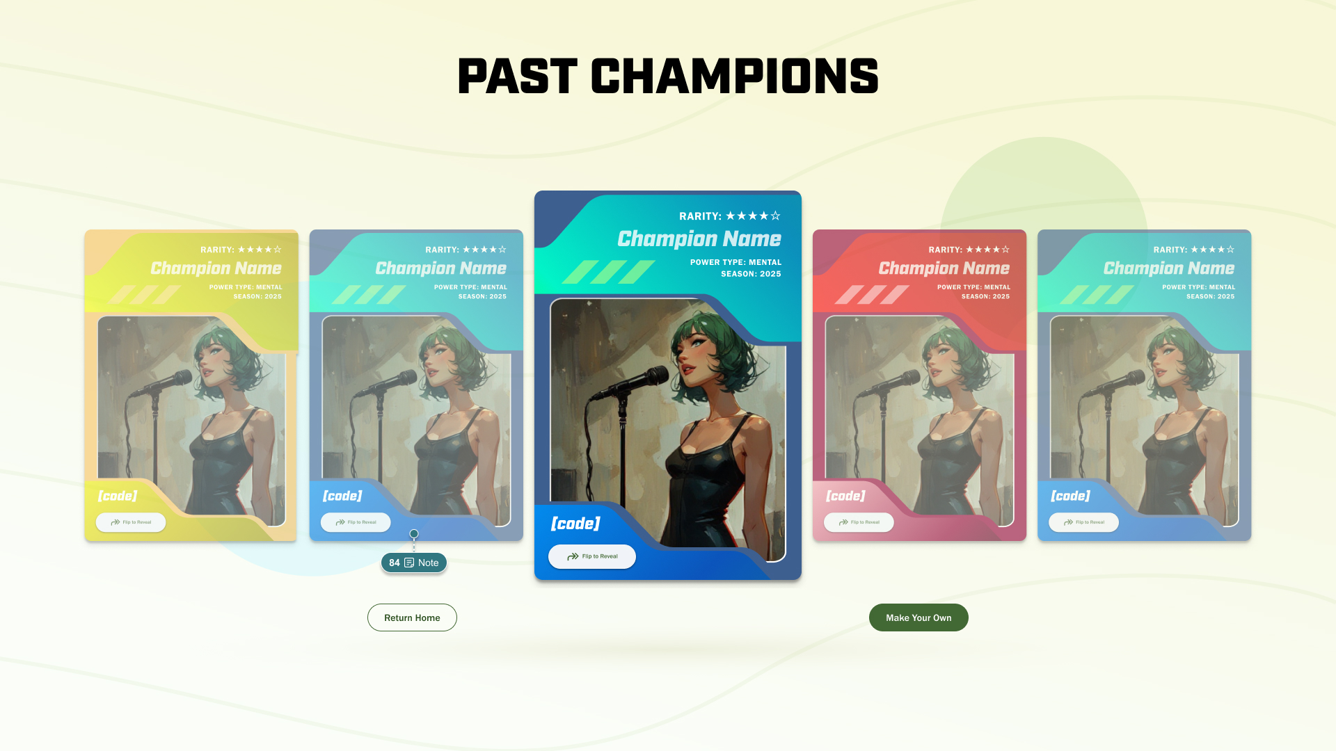
The last five cards generated are displayed at the start of each session, which solved a brief requirement and a practical problem at the same time. The brief asked for something families could share and compare without downloading anything or photographing a screen, and a wall of recent cards does that. Testing showed kids enjoyed reading other people's stats and comparing champions, so putting it at the start builds investment before anyone has answered a question. It also replaced the obvious alternative, a looping idle animation, which in a busy community centre becomes background noise for everyone walking past.
Timeline Wall
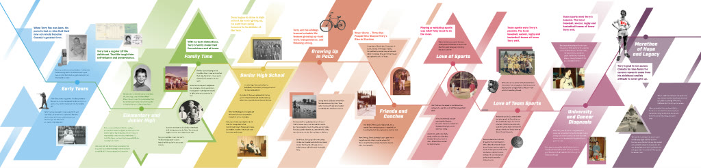
On the Timeline Wall I owned interaction planning, animation, and layout, with the dev team handling implementation. A 52" screen sits against a printed backdrop, and visitors push or pull it horizontally across 10 pivotal moments in Terry Fox's early life. An opening animation demonstrates the gesture before anyone needs to touch it. Stopping on a moment opens a panel with story and context. The physical wall carries the full narrative, and the digital layer rewards anyone who stops to explore.
Hall of Fame
On the Hall of Fame I owned the full UX and UI, and pushed the brief past a static gallery into a community portal that connects visitors to the clubs and programs running in Port Coquitlam today. It's a card-based experience across four sections: Champions, Builders, Awards, and Get Involved. Trivia, persistent navigation, and a CMS that lets any staff member update content without a developer are what make it something the city can keep growing.
Outcomes
A lobby that now has something to say.
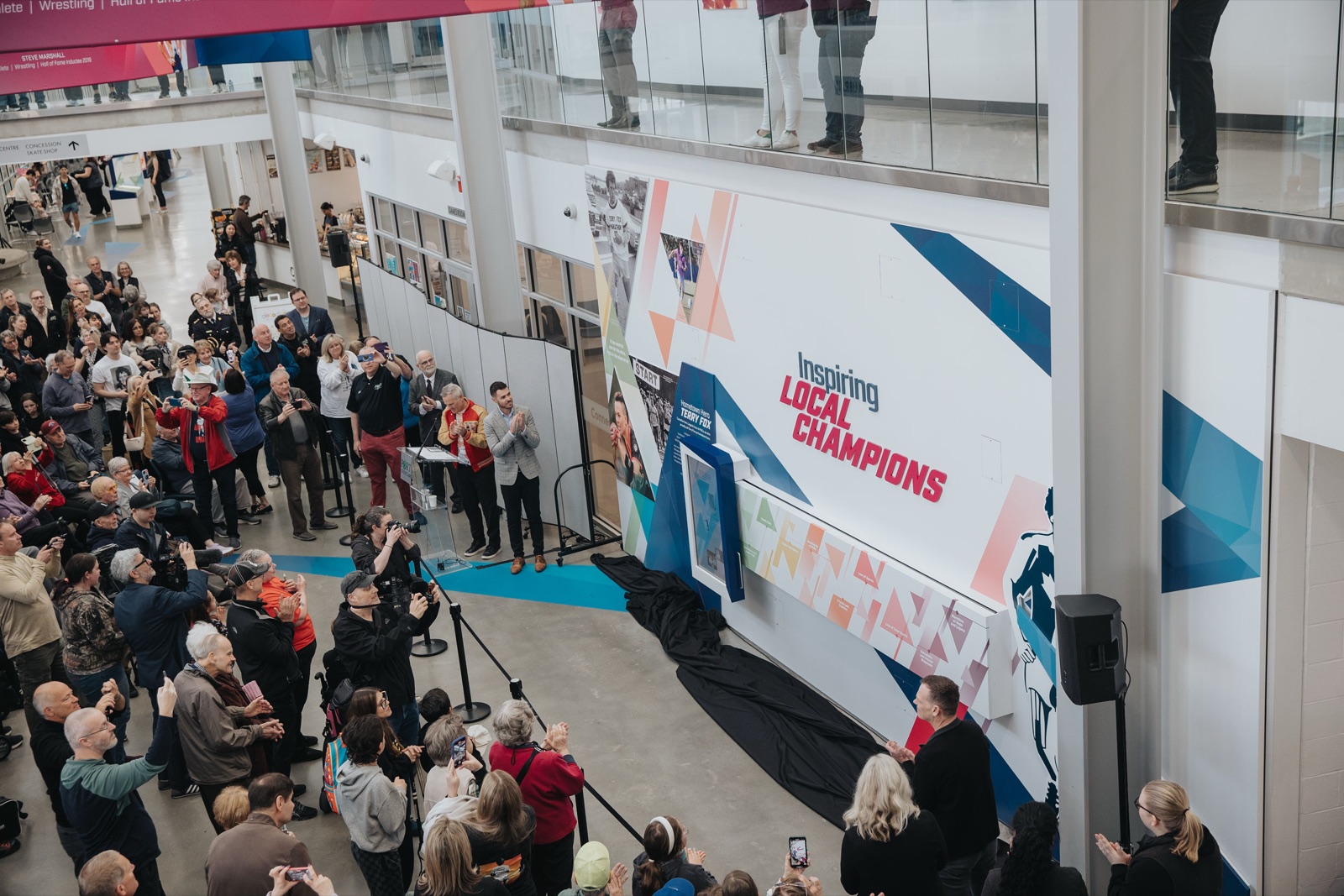
The exhibit opened in April 2025 to a strong response from the community, the City, and the Sports Alliance. A hallway people used to walk through became somewhere they stop.
"The design team were fantastic. They were collaborative, innovative, and they went the extra mile to really hit this project out of the park."
— Carrie Nimmo, Manager of Cultural Development & Community Services, City of Port Coquitlam
It was nominated for Heritage BC's 2026 People's Choice Award, and featured on CTV News Vancouver at launch.
Reflection
Retrospective
The architecture behind My Champion is what I'd revisit first. Correlating personality types to champion traits added real depth, but it also cost a lot of time, first understanding the frameworks and then threading them into an interaction that had to feel effortless. I'd simplify that model earlier now, and spend the complexity budget on the parts of the experience visitors actually feel.
Training the model took longer than expected, and the sticking point was an assumption we didn't question early enough. The written content already in the experience, the question copy and champion descriptions and values language, looked like a natural training source. It wasn't. Raw copy produced unpredictable output. The model drifted, invented phrasing, or wrote something technically fine but tonally wrong for a community centre. What fixed it was a fixed two-sentence template with keywords swapped in from the user's selections. Constrain the input format, vary only the words that need to vary, and the output stays consistent and safe.
The Timeline Wall taught me something about hardware dependency. Blending a digital screen into a printed physical background is a different problem when you can't test against the real hardware at full scale. A smaller test environment gets you most of the way, but colour calibration, motion response, and how the piece reads at size only surface once it's actually that size. I'd push harder and earlier now to lock hardware down, so a physical prototype is in front of the client while the design can still change.